
25 Classic Color Ideas for House Interior Design: From Calm Neutrals to Bold Drama
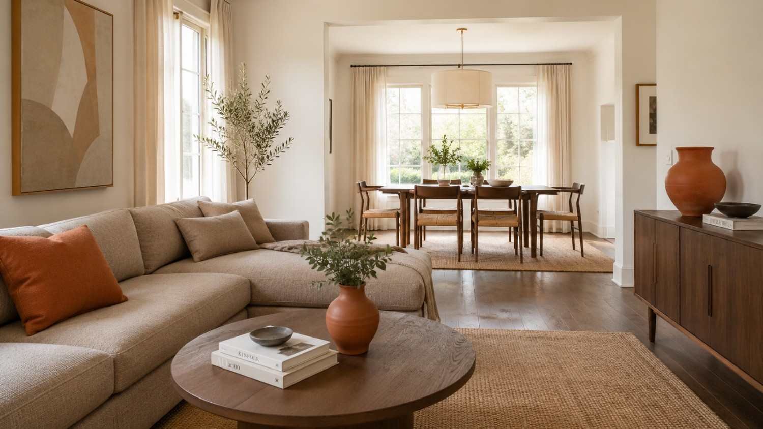
Color shapes how a home feels before anyone notices the furniture. Leading paint makers such as Sherwin-Williams, Benjamin Moore, and Farrow & Ball have spent decades proving that one wall color can change a room’s mood. The Pantone Color Institute named Mocha Mousse its 2025 shade, and chose Cloud Dancer, a soft white, for 2026. Both point to a clear shift toward warmth and calm. These 25 color ideas for house interior design show how to bring that mood home, from Scandinavian softness to Mediterranean warmth.
How to Choose Color Ideas for House Interior Design
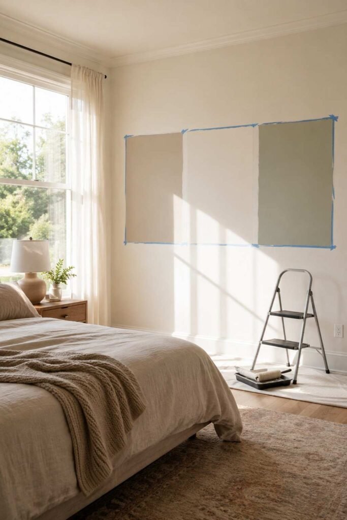
Start with light, not paint chips. A north-facing room gets cooler, bluer light, so gray can look flat and cold. A south-facing room gets warm light for most of the day, which suits both cool and warm shades. Check each color in the morning, at noon, and in the evening before you commit.
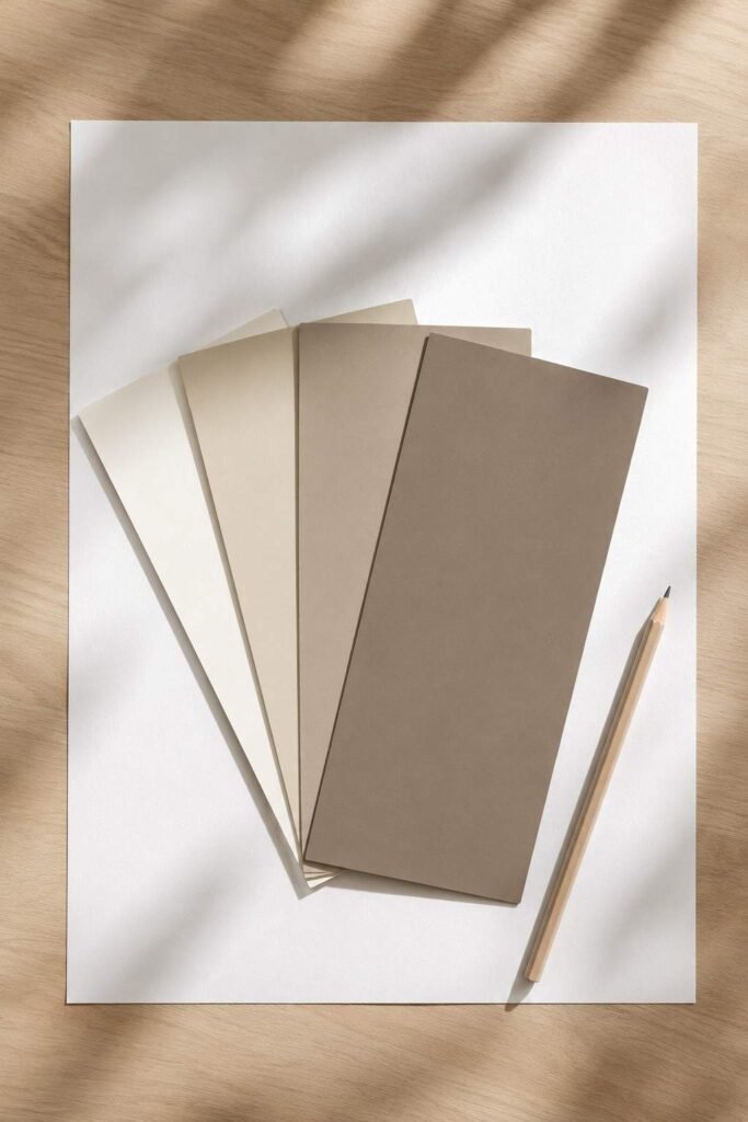
Next, look at undertones. Every neutral leans warm (yellow, red) or cool (blue, green, violet). Hold a swatch against pure white paper to see the lean. Also check the Light Reflectance Value (LRV), a scale from 0 (black) to 100 (white). Higher LRV colors bounce more light and make small rooms feel larger.
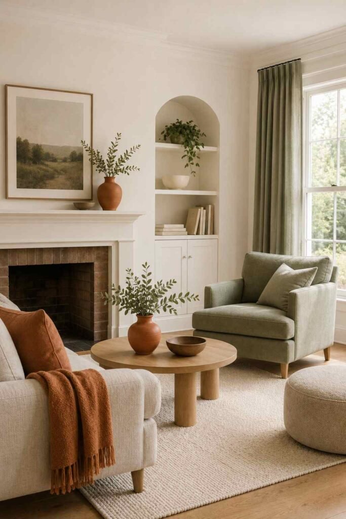
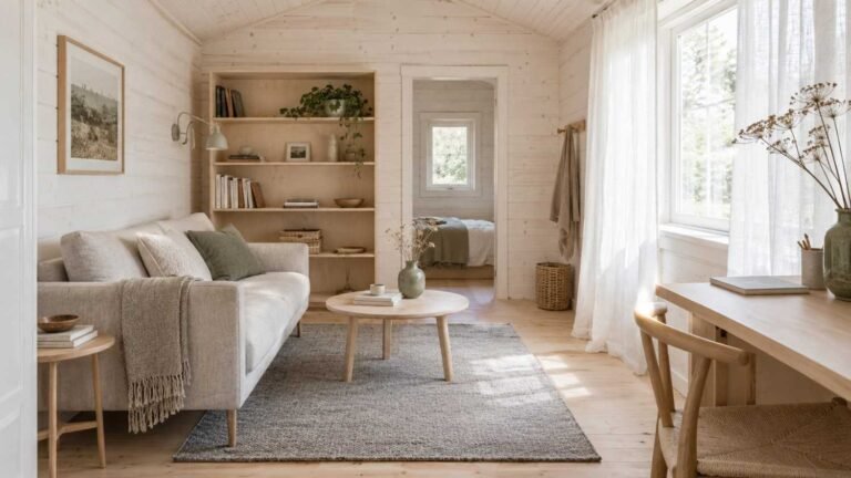
Finally, use the 60-30-10 rule. Let one color cover 60% of the room, a second take 30%, and an accent fill the last 10%. This simple ratio keeps even bold palettes balanced. The calm, clean look of Scandinavian interior style pairs especially well with the warm neutrals above.
Warm Neutral Color Ideas for House Interior Design
Warm neutrals suit living rooms, hallways, and open-plan spaces. They feel welcoming and pair easily with wood, linen, and brass.
1. Creamy Off-White
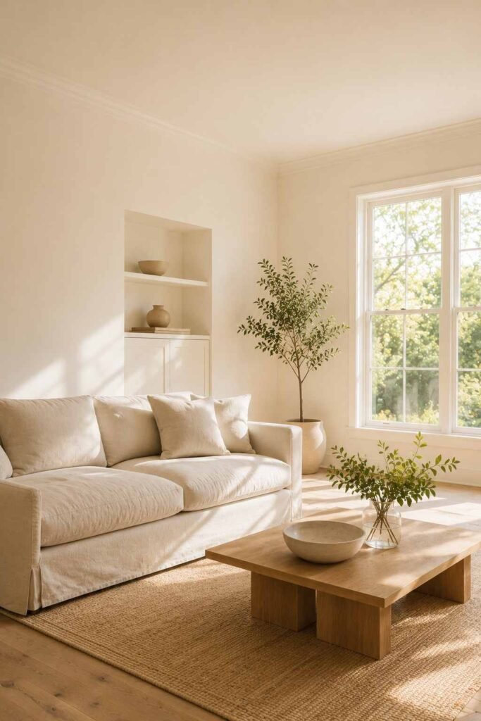
Pure white can feel clinical. A creamy off-white such as Benjamin Moore White Dove (OC-17) or Sherwin-Williams Alabaster (SW 7008) keeps the brightness but adds softness. It works on walls, trim, and ceilings together, which creates a calm, unbroken look. Use it in homes with lots of natural light, where it glows without turning yellow.
2. Warm Greige
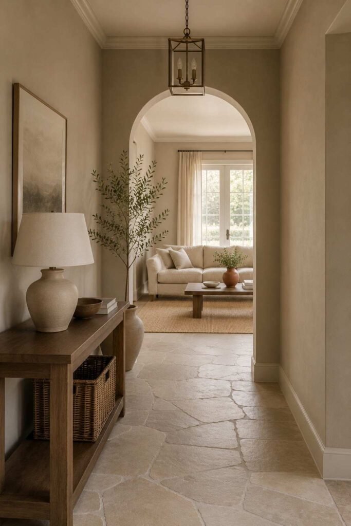
Greige blends beige and gray, solving the problem of choosing between them. Sherwin-Williams Accessible Beige (SW 7036) is a popular example. It looks warm in daylight and stays neutral under lamps. It is a safe choice for whole-house schemes because it connects rooms without making each one look the same.
3. Soft Mushroom
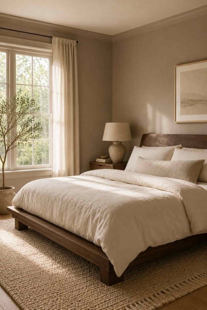
Mushroom shades sit between taupe and gray with a hint of pink. They feel earthy and quiet. Try them in bedrooms, where a restful mood matters most. Pair mushroom walls with ivory bedding, a woven rug, and dark wood furniture. The result feels layered and calm, much like the Pantone Mocha Mousse trend.
4. Sandy Beige
Sandy beige brings beach-house ease indoors. Sherwin-Williams Kilim Beige (SW 6106) carries a gentle golden warmth that flatters stone floors and rattan furniture. It is ideal for sunrooms and dining areas. Add white linen curtains and a jute rug to keep the look light rather than heavy.
5. Warm Taupe
Taupe adds depth without darkness. It suits home offices and living rooms that need a grounded, mature feel. Benjamin Moore Revere Pewter (HC-172) is a well-known choice in this family. It reads as a soft taupe-gray, so it adapts well to changing light. Balance it with white trim for crisp edges.
Cool and Calming Color Ideas for House Interior Design
Cool tones slow the pulse and make rooms feel open. They are popular in bedrooms, bathrooms, and studies.
6. Misty Blue-Gray
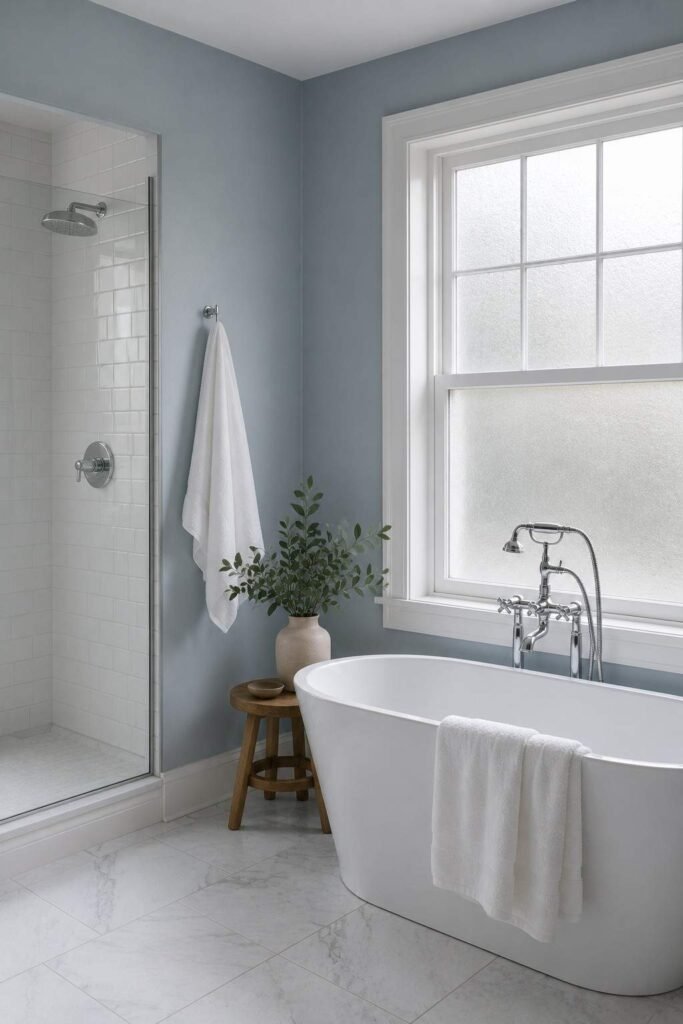
Blue-gray feels like a foggy morning. Sherwin-Williams Rainwashed (SW 6211) leans soft aqua and works well in bathrooms and bedrooms. It looks fresh against white tile and chrome fixtures. Because it is light, it also helps small rooms feel less boxed in.
7. Classic Navy
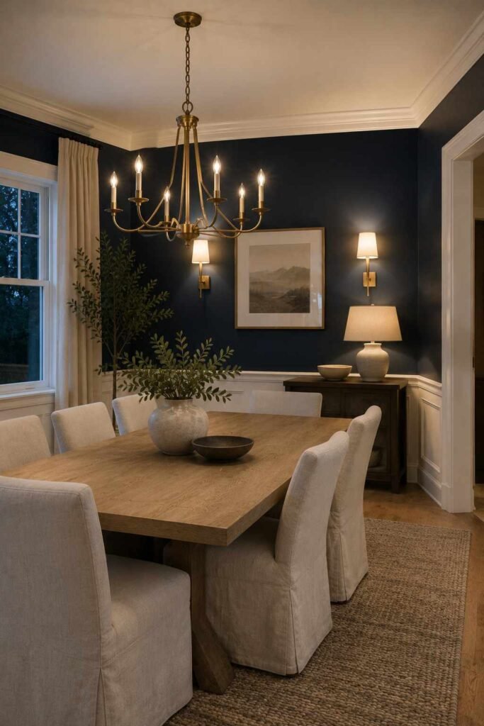
Navy is the dependable dark. Benjamin Moore Hale Navy (HC-154) gives a room a tailored, confident look. It suits dining rooms, libraries, and accent walls behind beds. Pair it with white trim and brass hardware for a traditional feel, or with light oak for a modern one. Keep lighting layered so the color feels rich rather than heavy.
8. Pale Sky Blue
Pale blue has long been used on porch ceilings, and it works inside too. It feels airy and cheerful, especially in nurseries and kitchens. Choose a version with a touch of gray so it doesn’t look childish. White cabinets and natural wood balance it nicely.
9. Sage Green
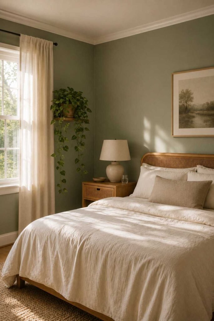
Sage is one of the most loved interior shades of recent years. Sherwin-Williams Sea Salt (SW 6204) shifts between green, gray, and blue depending on light. It feels spa-like in bathrooms and gentle in bedrooms. Add cream textiles and a few houseplants to strengthen the natural mood.
10. Soft Teal
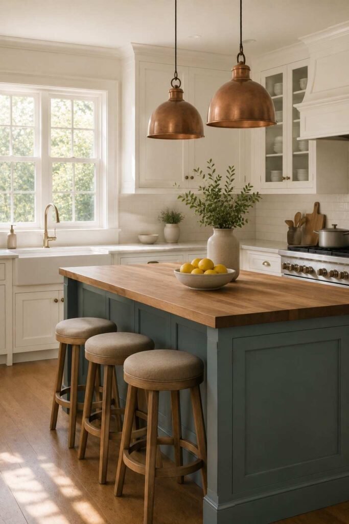
Teal adds personality without shouting. Benjamin Moore Aegean Teal (2136-40) is a muted, gray-leaning option that feels sophisticated. Try it on a single wall, a kitchen island, or a front door. It looks striking next to warm woods and copper accents.
Earthy and Nature-Inspired Color Ideas for House Interior Design
Earth tones connect a home to its surroundings. They age well and rarely feel dated.
11. Terracotta
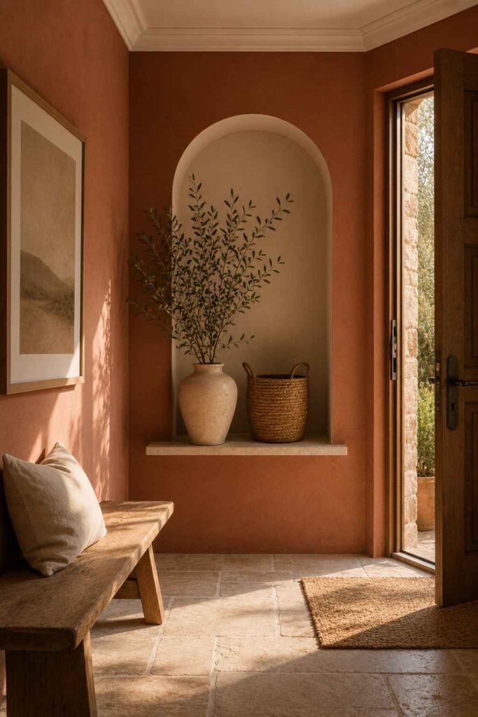
Terracotta brings sun-baked warmth to a room. Sherwin-Williams Cavern Clay (SW 7701) is a rich, muted example. It looks lovely in entryways and dining rooms, particularly under warm lighting. Pair it with cream, olive, and woven textures for a Mediterranean look.
12. Olive Green
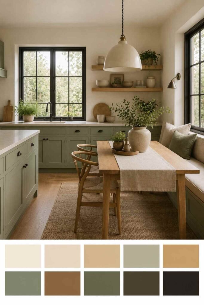
Olive is deeper and more grounded than sage. It makes a strong choice for studies, living rooms, and kitchen cabinets. Pair it with leather, walnut, and aged brass. The combination feels collected and timeless, as if the room has always been there.
13. Forest Green
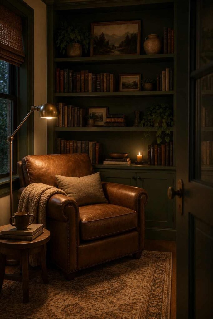
Forest green feels sheltered and rich. Sherwin-Williams Evergreen Fog (SW 9130) is a softer take that stays easy to live with. Use it in a reading nook or on built-in shelving. Warm bulbs help the color glow at night rather than turn black.
14. Clay Pink
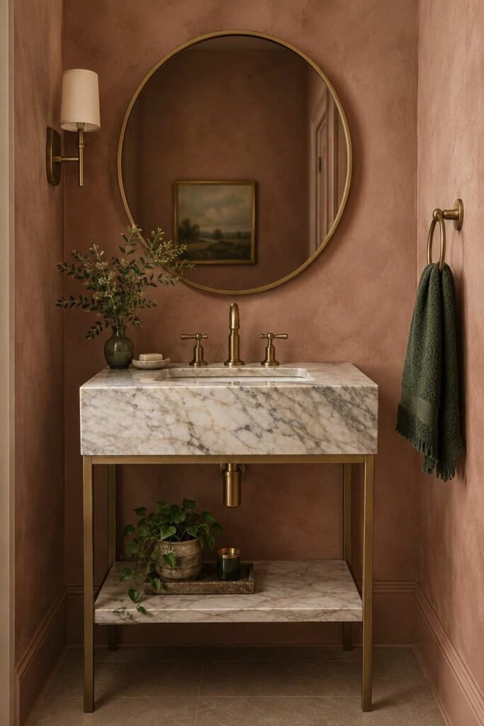
Clay pink is a muted, earthy blush that feels grown-up. It looks lovely in bedrooms and powder rooms, where a little drama is welcome. Pair it with deep green or chocolate brown to keep it from reading sweet. Matte finishes give it a plaster-like softness.
15. Golden Ochre
Ochre adds sunshine on cloudy days. Use it sparingly, perhaps on a hallway, a cabinet, or through textiles. A little goes a long way. Combine it with navy or charcoal so the warmth feels purposeful. In small doses, it brightens a space without overwhelming it.
Bold and Dramatic Color Ideas for House Interior Design
Dark and saturated colors create atmosphere. They work best in rooms used mostly at night, such as dining rooms and media rooms. For a light, airy first impression, explore these entrance hall ideas for Scandinavian interior design that use pale woods and soft whites.
16. Charcoal Gray
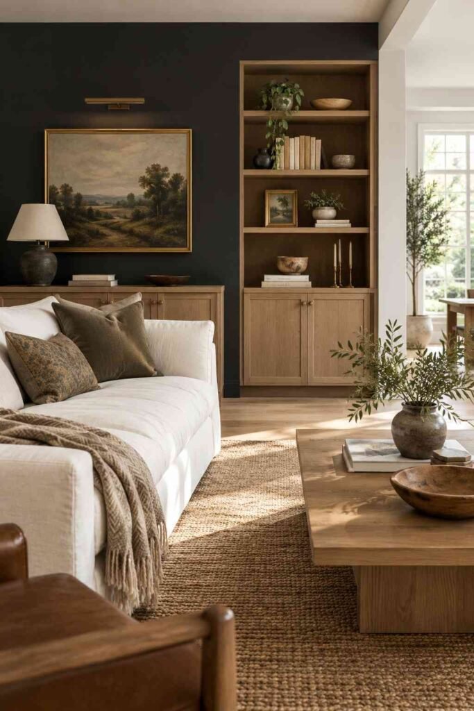
Charcoal is the modern classic. Sherwin-Williams Iron Ore (SW 7069) is a soft black that feels less harsh than true black. It suits feature walls, doors, and cabinetry. Add light wood and white linen to stop the room from feeling heavy.
17. Deep Black
A true black room feels like a jewel box. Sherwin-Williams Tricorn Black (SW 6258) is a popular option for doors, trim, and window frames. Use it where you want crisp contrast. Keep the finish matte or satin to avoid glare, and add plenty of warm light.
18. Burgundy and Oxblood
Oxblood brings old-world richness. It suits dining rooms and libraries, where candlelight and dark wood already set the mood. Pair it with cream trim and brass fittings. Because it is deep, it works best with good lighting and a few light elements to lift it.
19. Emerald Green
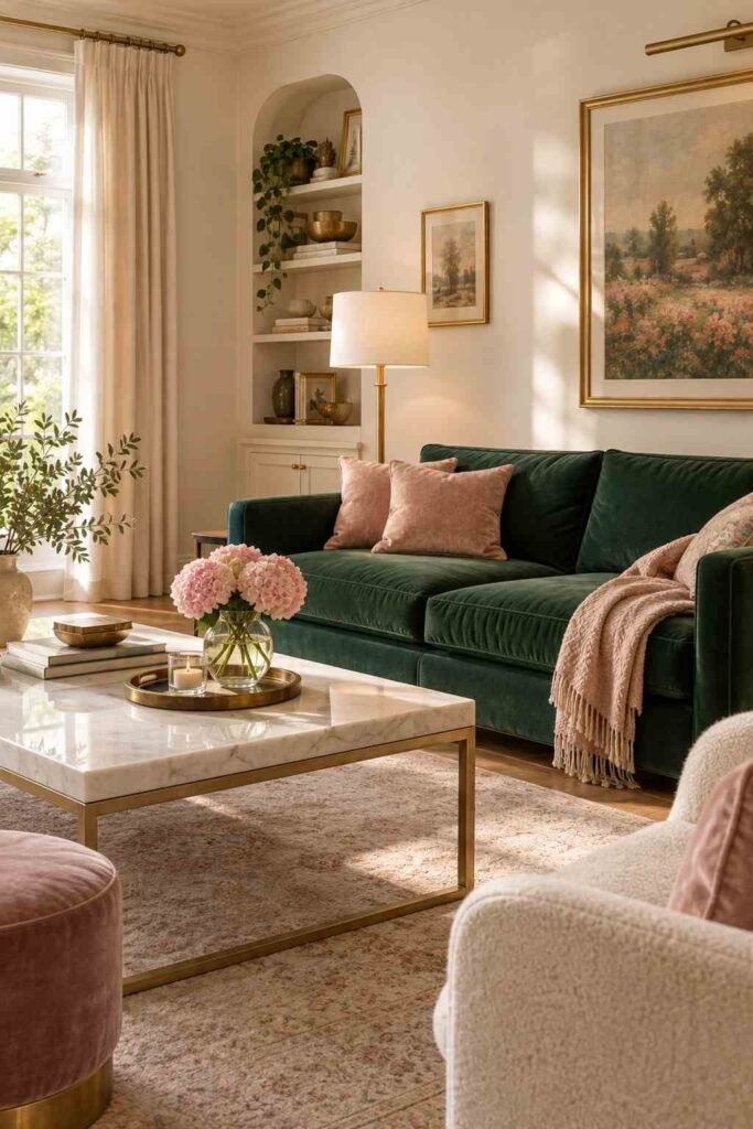
Emerald is vivid yet elegant. It makes a stunning velvet sofa, kitchen cabinet, or accent wall. Pair it with gold, white marble, and soft pink for a classic jewel palette. Use it as a hero color rather than covering every wall.
20. Midnight Blue
Midnight blue is deeper than navy and nearly black in low light. It gives bedrooms and dens a cozy, enveloping feel. Layer it with textured fabrics, such as wool throws and linen pillows, so the room feels soft rather than severe.
Soft Pastel and Light Color Ideas for House Interior Design
Pastels brighten a home and suit smaller spaces. Chosen carefully, they feel fresh rather than sugary. If you love relaxed, rustic charm, browse our Scandinavian cottage interior design ideas for cozy palettes and natural textures.
21. Butter Yellow
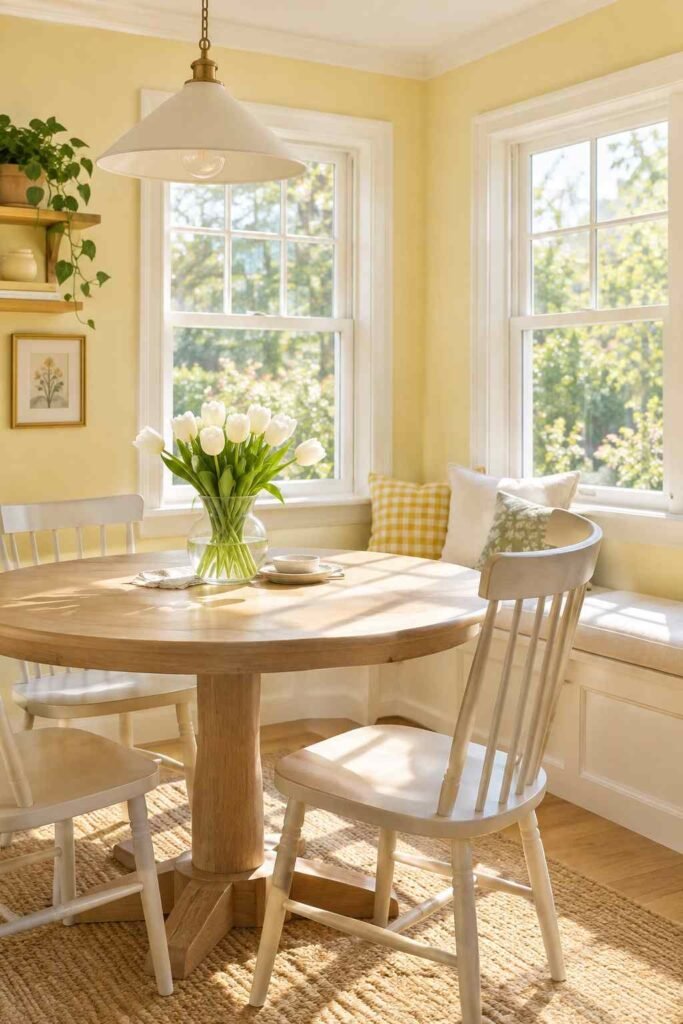
Butter yellow has returned as a gentle alternative to white. It feels sunny and kind. Try it in kitchens, breakfast nooks, and sunrooms. Pair it with white trim and pale wood. The mix feels cheerful but still calm.
22. Soft Lavender-Gray
Lavender-gray is subtle and quietly stylish. It reads as a neutral in some light and a gentle purple in others. It suits bedrooms and bathrooms. Combine it with silver, white, and pale wood for a serene result.
23. Pistachio and Mint
Pistachio gives a retro touch with a modern edge. It works in kitchens, laundry rooms, and bathrooms. Pair it with cream and warm wood to keep it grown-up. A muted version feels fresh without looking like a themed room.
24. Peach and Apricot
Peach is warm, friendly, and flattering. It makes skin tones glow, so it works well in bathrooms and dressing rooms. Soft apricot pairs well with cream, tan, and light blue. Use it on walls or through a statement chair.
25. Cloud White
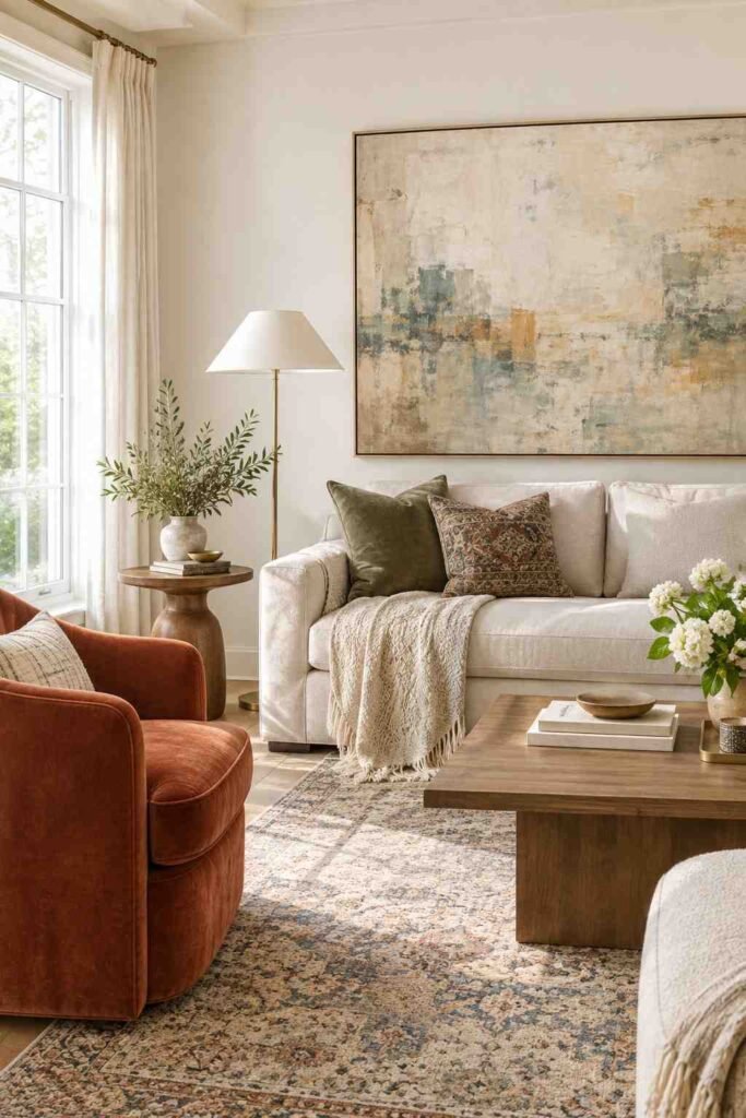
Inspired by the Pantone Cloud Dancer trend, cloud white is a clean, airy white with just enough softness. It makes a gallery-like backdrop for art and pattern. Use it in homes where you want color to come from furniture, rugs, and decor instead of the walls.
Expert Tips to Apply These Color Ideas for House Interior Design
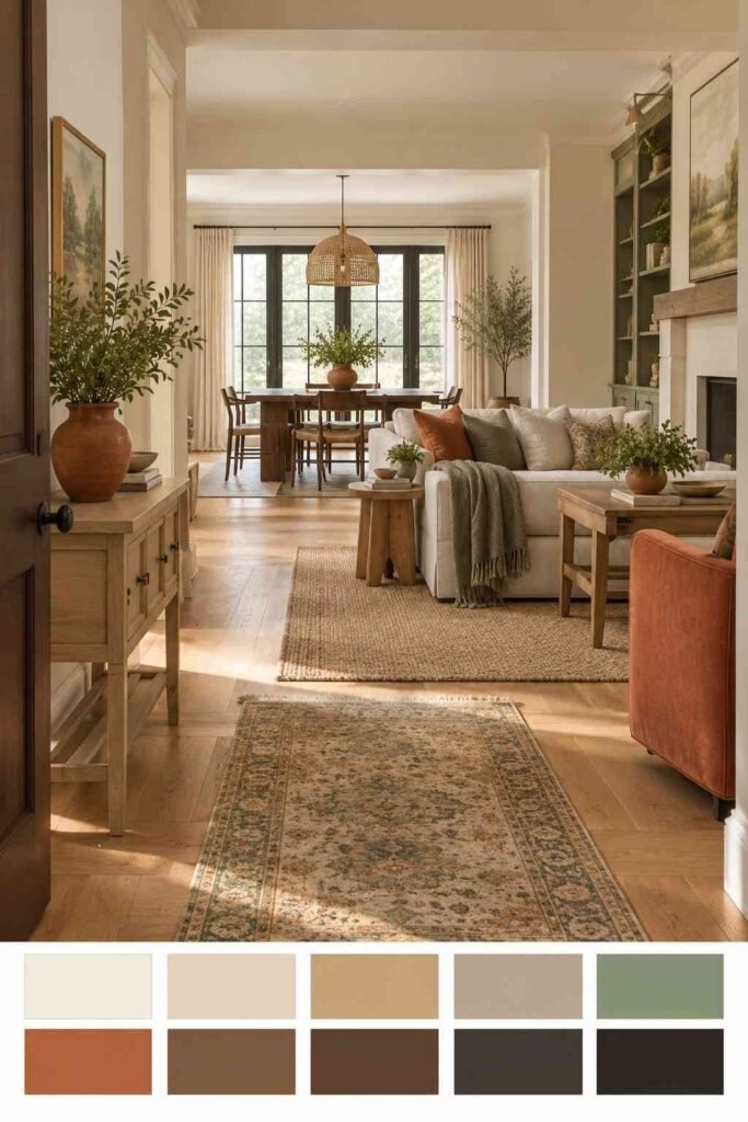
Test every color on a large sample board, at least two feet square, and move it around the room. Paint two coats before judging, because the first coat often looks patchy.
Think about flow between rooms. Colors that share an undertone feel connected, even when their depths differ. Repeat one accent, such as brass or black, across the house to tie the look together.
Finish matters as much as color. Matte hides wall flaws and feels soft. Eggshell and satin are easier to wipe, so they suit kitchens, hallways, and children’s rooms. Use semi-gloss on trim and doors for durability.
Conclusion
Good color does not need to be loud. It needs to suit your light, your furniture, and the way you live. Whether you prefer the quiet comfort of greige, the calm of sage, or the drama of navy, these color ideas for house interior design give you a clear place to start. Choose two or three favorites, test them at different times of day, and let one shade lead the room. For more inspiration on furniture and decor that complements these shades, visit outinteriors.




2 Comments