
Unique 22 Two-Tone Kitchen Cabinet Ideas for 2026 (That Actually Hold Their Value)
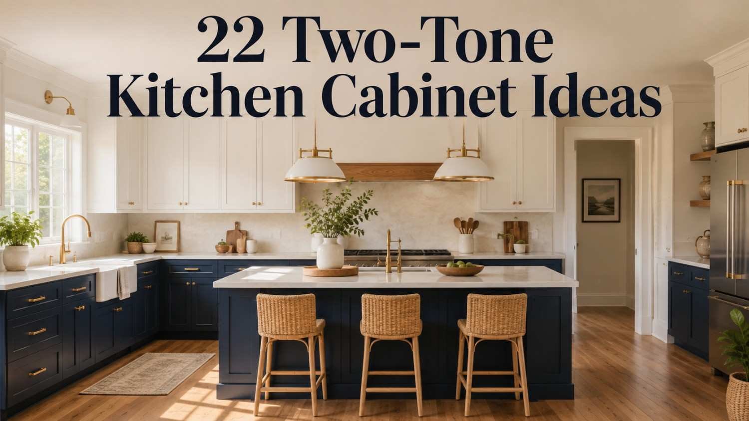
Walk into almost any freshly renovated kitchen in 2026, and there’s a good chance the cabinets aren’t wearing just one color. Two-tone kitchen cabinets have moved from a niche designer trick into one of the most requested looks in American kitchens, and for good reason. A single paint color can start to feel flat after a few years, but pairing two tones adds depth, warmth, and a sense of intention to the room a family actually lives in every day.
This guide brings together 22 two-tone kitchen cabinet ideas, the color-balancing rule professional designers rely on, real cost ranges, and the mistakes that quietly hurt resale value down the road. Whether you’re planning a full remodel or simply refreshing an island, there’s a combination here worth considering.
What Are Two-Tone Kitchen Cabinets, and Why Do They Work?
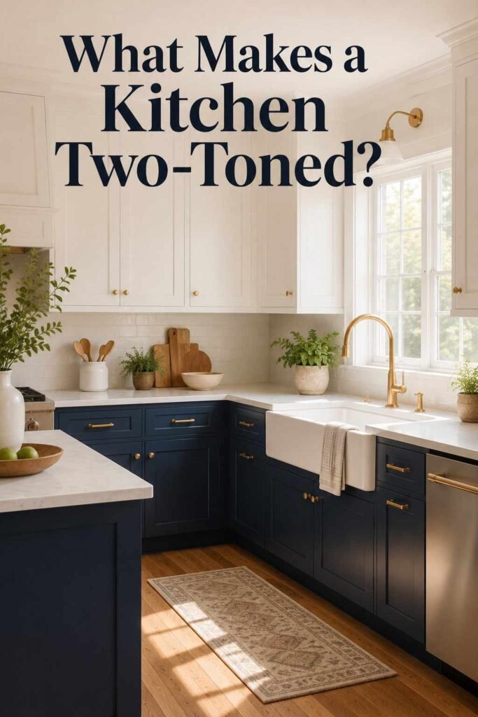
Two-tone kitchen cabinets simply mean using two different colors, finishes, or materials within one kitchen layout instead of painting every cabinet to match. The most common version pairs lighter upper cabinets with a deeper tone on the lower cabinets, though contrasting the island against the surrounding perimeter is just as popular.
The idea isn’t purely decorative, either. Splitting the color scheme this way can make ceilings feel taller, ground an otherwise busy room, and draw attention to architectural details like a pantry wall or a window seat. It also solves a practical problem: an all-white kitchen shows scuffs and fingerprints at counter height, while lower cabinets in a darker shade hide daily wear far better. Done thoughtfully, the result reads as intentional rather than mismatched, which is exactly why this approach has outlasted so many shorter-lived kitchen trends.
22 Two-Tone Kitchen Cabinet Ideas Worth Copying
Classic and Timeless Pairings
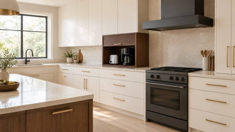
1. White Uppers, Natural Oak Lowers — A bright top half with warm, visible wood grain below is the most widely used version of this contrasting cabinetry layout, and it works in almost every home style, from farmhouse to transitional.
2. White Perimeter, Walnut Island — Keep the walls light and reflective, then let the island carry a rich, dark wood tone as the room’s natural anchor and gathering spot.
3. Warm Shaker White and Honey Maple — Soft, creamy shaker doors on top paired with honey-toned maple on the base cabinets create an inviting, farmhouse-leaning feel.
4. Cream Uppers, Espresso Lowers — Deep brown lower cabinets ground the room visually, while cream above keeps the space from feeling heavy or closed in.
5. Two Shades of Wood — Mixing a lighter white oak with a darker walnut skips paint entirely and leans into natural material contrast, a look that rarely goes out of style.
Bold Color Statements
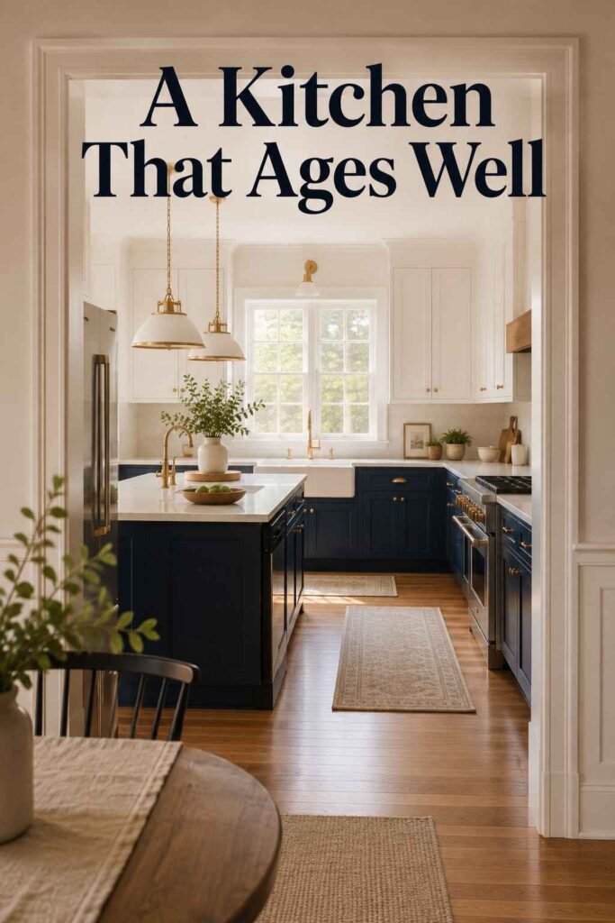
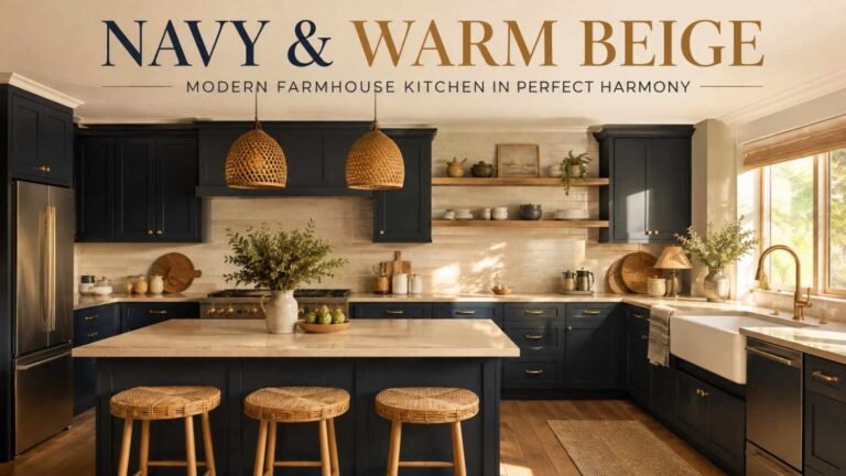
6. Navy Lowers, White Uppers
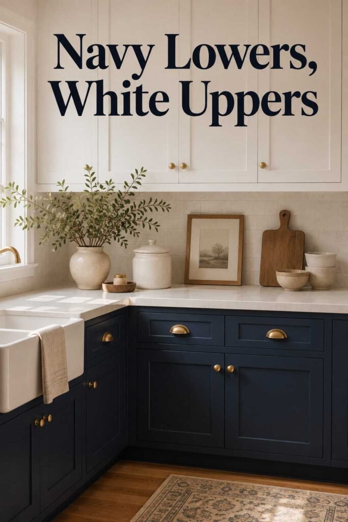
This remains one of the best-performing pairings for both long-term style and buyer appeal; for a deeper dive into shade selection and hardware pairing, these navy kitchen cabinet ideas are worth bookmarking before you pick a swatch.
7. Navy Island, White Perimeter — Commit the boldest color choice to just the island so the rest of the kitchen stays neutral and adaptable.
8. Emerald Green Lowers, White Uppers — A jewel-toned base under crisp white keeps a saturated color from overwhelming a smaller room.
9. Matte Black and Warm Wood — Black lower cabinets, or a single black pantry wall, next to warm oak reads industrial and modern without feeling cold.
10. Terracotta Lowers, Cream Uppers — A warmer, earthier alternative to navy or black that pairs naturally with brass hardware and honed stone counters.
Accent and Zone-Based Layouts
11. Contrasting Pantry Wall — Paint only the tall pantry bank a different color to visually separate storage from the main cooking zone.
12. Two-Tone Peninsula — Use the peninsula’s opposite tone to mark the transition between the kitchen and an adjoining dining area.
13. Open Shelving Break — Swap one section of upper cabinets for wood open shelving set against painted lower cabinets for texture and storage variety.
14. Range Hood as the Accent — Paint or clad just the hood vent in the second tone so it becomes a built-in focal point above the stove.
Subtle and Tonal Pairings
15. Soft Gray and Charcoal — Two shades from the same gray family create a quiet, layered look without the visual jump of high contrast.
16. Warm Greige and Off-White — Pairing a warm gray lower cabinet with a creamy upper photographs well and avoids the sterile feeling that cooler grays can bring.
17. Sage Green and Warm White — Sage’s muted, earthy quality pairs naturally with wood floors, brass fixtures, and natural light.
18. Blush and Warm White — A barely-there pink lower cabinet against white uppers adds personality without dominating the room.
Modern Texture and Detail Mixes
19. Door Frame vs. Panel Contrast — Paint the cabinet frame one color and the recessed door panel another for a subtle two-tone effect within a single run of cabinetry.
20. Glass Upper Doors, Solid Lower Color — Glass-front uppers paired with a bold, solid lower cabinet color break up what would otherwise be a heavy block of one hue.
21. Matte and Gloss Mix — Use the same paint color in two different finishes, matte on top and gloss below, for texture without introducing a new hue.
22. Graphic Checkerboard Island — A black-and-white checkerboard finish on just the island, finished with brass trim, works as a statement piece in kitchens with room to carry a bold focal point.
The 60-30-10 Rule for Balancing Two-Tone Kitchen Cabinets
One mistake shows up more than any other: treating both colors as equal partners. A 50/50 split may sound balanced on paper, but in a real kitchen it often creates a visual divide, making the space feel like two separate rooms forced together rather than one cohesive design.
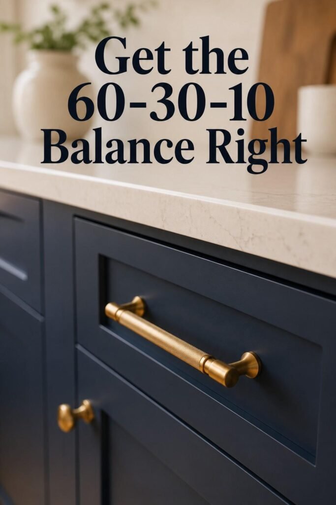
Designers who work with dual-tone cabinetry regularly lean on a 60-30-10 ratio instead. Roughly 60% of the visible cabinetry stays in the dominant, lighter color; 30% goes to the secondary, deeper tone, usually the lower cabinets or island; and the final 10% is reserved for accents like hardware, lighting, or a contrasting backsplash detail. This ratio gives the eye a clear focal point and keeps the kitchen feeling planned rather than chaotic, even when the color pairing itself is bold.
How Much Do Two-Tone Kitchen Cabinets Cost?
Because two colors typically mean two separate paint or stain processes, additional masking, and more precise finish work, this contrasting cabinet style generally carries a 15% to 22% premium over a single-color installation. Custom paint programs offered by some cabinet makers have started narrowing that gap, since batching both colors into one production run reduces the labor overhead that used to drive the price up.
Where you spend the premium matters more than the total. Concentrating the bolder, pricier color on a single island or accent wall of cabinetry — rather than painting the entire kitchen in two full colors — delivers most of the visual impact of this look without doubling your finish costs across every cabinet box.
Two-Tone Kitchen Cabinets and Resale Value in 2026
Buyers touring homes this year are looking for kitchens that feel warm and lived-in rather than sterile. Pairings like navy and white continue to test well with buyers because the contrast reads as intentional design rather than a passing trend, and the lighter half keeps the overall room bright.
That said, resale-conscious homeowners should be cautious about going too dark. Wall-to-wall saturated color, even in a popular shade, can make a room with limited natural light feel smaller and harder to photograph for a listing. The safest approach keeps the lighter tone as the dominant 60%, reserves the deeper or trendier color for the lower cabinets or island, and chooses warm undertones over stark, cool ones wherever possible.
5 Mistakes to Avoid With Two-Tone Kitchen Cabinets
- Splitting colors 50/50. It rarely reads as balanced; follow the 60-30-10 ratio instead.
- Going fully dark in a low-light kitchen. Deep tones on every surface can shrink a room that doesn’t get much natural sun.
- Mismatching hardware finishes. Switching metals for each color zone without a unifying element, like a shared cabinet pull style, can make the kitchen feel disjointed.
- Skipping the durability check. Cheaper MDF doors can crack at the joints or separate at the paint line years after installation; ask about the substrate before committing to color.
- Skipping the lighting test. A swatch that looks perfect under store lighting can shift dramatically under morning sun or evening bulbs, so test samples in your own kitchen first.
Two-Tone Cabinet Ideas for Small Kitchens
Space constraints don’t rule out a two-tone kitchen; they just change the ratio. Keep the dominant 60% in a light color on the upper cabinets and walls to preserve the feeling of height and openness, then use the darker tone sparingly on lower cabinets or a single small island. Glass-front upper doors (idea #20 above) are especially useful in tight kitchens, since they add depth without adding visual weight. If you’re pulling together a broader palette for the rest of the home, browsing a few luxury beige living room ideas can help you carry the same warm, neutral foundation from the kitchen into adjoining living spaces for a more cohesive flow room to room.
Conclusion
This two-toned cabinetry style has earned its staying power because it solves a real design problem: a single color eventually feels flat, but two thoughtfully chosen tones add warmth, contrast, and personality without sacrificing cohesion. Whether you gravitate toward a classic white-and-oak pairing, a bold navy island, or a quieter tonal gray combination, the ideas above give you a starting point for 2026 and beyond. Keep the 60-30-10 ratio in mind, test your samples in real lighting, and choose a color pairing you’ll still want to look at in ten years, not just ten months. For more room-by-room color inspiration and finish comparisons, the design library at outinteriors is a useful next stop.
Frequently Asked Questions
1. What is the most popular two-tone kitchen cabinet combination?
White uppers paired with a natural wood or navy lower cabinet remain the most requested combination, largely because it balances brightness with warmth and suits nearly every home style.
2. Do two-tone kitchen cabinets cost more than single-color cabinets?
Yes, typically 15% to 22% more, since two separate finish processes and additional masking work are involved. Limiting the second color to an island or accent section can reduce the added cost.
3. Will two-tone kitchen cabinets hurt my home’s resale value?
Not if the palette stays balanced. Pairings that keep a light, neutral tone as the dominant color and use bolder shades like navy or green as an accent tend to perform well with buyers.
4. What is the 60-30-10 rule for kitchen cabinets?
It’s a color-balancing guideline where 60% of the cabinetry uses the dominant tone, 30% uses a secondary tone, and 10% is reserved for accents like hardware or lighting, preventing an even 50/50 split from feeling disconnected.
5. Can I do two-tone cabinets in a small kitchen?
Yes. Keep the lighter color dominant on the upper cabinets to preserve openness, and use the deeper tone only on lower cabinets or a small island rather than throughout the whole room.
6. What door style works best for two-tone kitchen cabinets?
Shaker-style doors are the most versatile choice, since their simple, recessed-panel profile pairs cleanly with almost any color combination, from classic wood tones to bold painted finishes.
7. How do I keep two-tone cabinets from looking dated in a few years?
Stick to timeless pairings, such as white with natural wood or soft tonal grays, and reserve trendier colors like emerald or terracotta for a smaller, easily repaintable surface like an island.
One Comment