Trendy 23 Bathroom Color Schemes That Instantly Upgrade Any Space in 2026
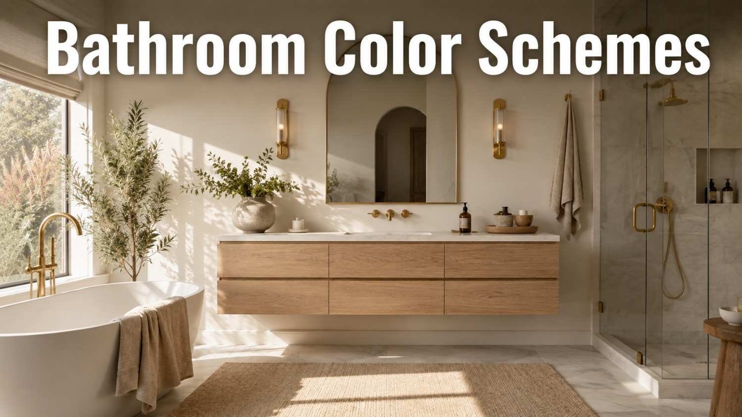
Choosing the right palette can make or break a remodel, and that’s why so many homeowners search for bathroom color schemes before they ever pick up a paintbrush. The right combination doesn’t just look good in photos — it shapes how the room feels every single morning, from a groggy 6 a.m. routine to a slow, unwinding soak. Whether you’re working with a tiny powder room or a spacious primary suite, the 23 palette ideas below cover neutral, warm, bold, coastal, and monochrome directions, plus the practical details — lighting, finishes, and undertones — that most roundups skip, so you can find a look that actually fits your home instead of a trend that fades in a year.
How to Choose the Right Bathroom Color Scheme for Your Space
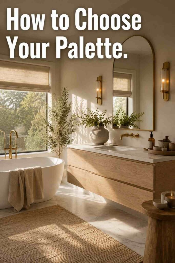
Before picking a bathroom color scheme, look at three things: natural light, room size, and the fixed finishes you’re keeping, like tile or a tub. North-facing bathrooms receive cooler, bluer light, so warm tones like cream or terracotta help balance the space. South-facing rooms get warmer light and can handle cooler blues or greens without feeling cold. Rooms with little to no windows benefit from warm whites or soft neutrals, since dark, saturated colors can make a windowless bathroom feel closed in rather than cozy.
It also helps to test paint on the actual wall, not just a swatch under store lighting. Bathroom lighting — especially vanity bulbs — changes how a color reads by the hour. Painting a large sample card and moving it around the room at different times of day is one of the simplest ways to avoid regret before committing to a full bathroom color palette.
Room size matters just as much as light. A powder room with no tub or shower can handle a saturated, dramatic hue because guests only spend a few minutes there, while a primary bathroom used daily tends to wear better in a softer, more livable tone. If you’re unsure where to start, pull inspiration from a single fixed element already in the room, such as tile, a rug, or a favorite towel color, and build the rest of the palette around it.
The Psychology of Color in a Bathroom
Color affects mood more than most homeowners realize, and it’s worth thinking about before picking up a brush. Blue and green tones are associated with calm and are often chosen for bathrooms because they echo water and nature, which can make a morning shower feel more restorative. Warm tones like terracotta, camel, and soft red add energy and coziness, but they read best in smaller doses since too much warmth in a small room can feel closed in rather than inviting.
Neutral hues such as white, cream, and greige are considered the most versatile because they don’t compete with existing tile, hardware, or decor, which is part of why they show up so often in real estate listings. Darker, saturated colors like navy or charcoal tend to feel more formal and grounding, making them a natural fit for a primary bathroom where you want the space to feel like a retreat rather than a purely functional room.
23 Bathroom Color Schemes to Inspire Your Next Remodel
Timeless Neutral Palettes
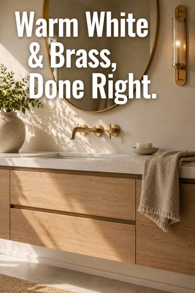
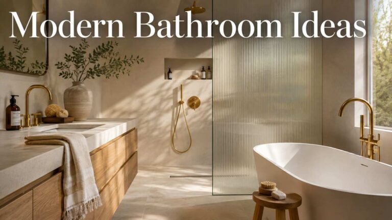
1. Warm White and Wood: Warm white walls paired with a stained wood vanity create a soft, spa-like base that never feels dated. Large mirrors bounce light around the room, keeping the space bright even without much natural sunlight.
2. Greige and Brushed Gold: Greige, a blend of gray and beige, gives a modern neutral base that pairs beautifully with brushed gold fixtures. It splits the difference between cool gray and warm beige, making it one of the safest bathroom color scheme choices for resale value.
3. Putty and Matte Black: Putty is a soft, earthy neutral that coordinates with almost anything. Combined with matte black hardware and light wood accents, it creates a calm, Japanese-inspired feel that suits both small and large bathrooms.
4. Cream and Walnut: Deep walnut cabinetry against cream walls adds warmth and contrast without overwhelming the space. This combination works especially well in bathrooms with brass or unlacquered hardware.
5. Taupe and Light Gray: Taupe walls paired with light gray tile bring a serene, cloudy quality reminiscent of natural marble veining. Wood flooring or a metallic tub introduces texture so the palette doesn’t feel flat.
Warm and Earthy Color Palettes
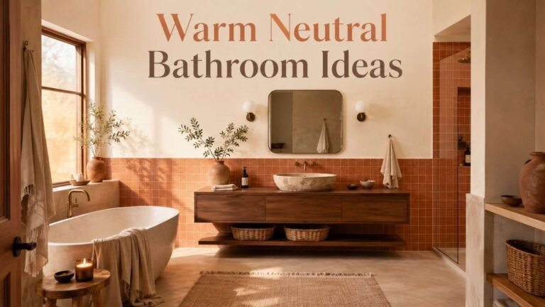
6. Terracotta and Cream: One of the standout 2026 bathroom color directions, terracotta brings clay-like warmth in small doses — a rug, an accent wall, or towels — against a cream backdrop. It’s an easy way to update a white bathroom without a full renovation.
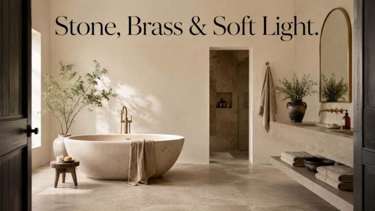
7. Sand Beige and Bronze: Sand-toned walls paired with bronze or antique brass fixtures feel grounded and timeless. This scheme works particularly well in bathrooms with stone-look porcelain tile.
8. Olive Green and White: Muted, soft olive has replaced brighter greens as a favorite shade for 2026. An olive vanity against clean white walls adds color without darkening the room.
9. Clay and Rattan: Warm clay-colored walls paired with rattan or woven storage baskets create an organic, textured look. It’s a strong option for anyone drawn to earthy, nature-inspired bathrooms.
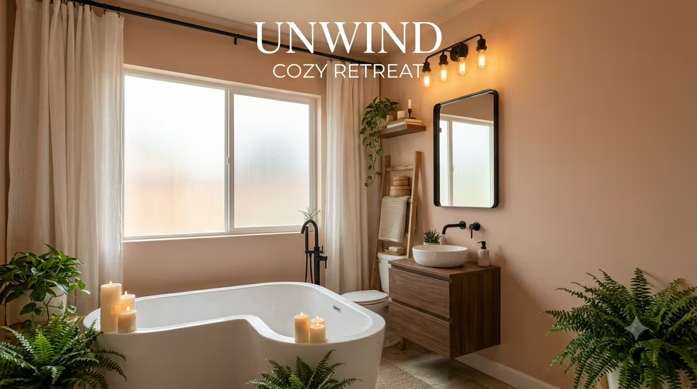
10. Camel and Matte Black: Camel-toned walls with matte black fixtures and hardware strike a balance between warmth and drama, making this a popular choice for primary bathrooms.
Bold and Jewel-Toned Palettes
11. Emerald Green and Brass: Deep emerald cabinetry or tile against white walls, finished with brass or gold hardware, delivers a luxe, editorial look that has stayed popular for several years running.
12. Sapphire Blue and White: Rich sapphire blue walls or vanity paneling against crisp white trim create high contrast and a sense of drama, especially in powder rooms where you can commit to a bolder statement.
13. Garnet Red and Gold: Garnet is a deep, wine-toned red that pairs beautifully with gold fixtures and a medicine cabinet as the anchor piece. This scheme works best in smaller, high-impact spaces.
14. Amethyst Purple and Chrome: A moody amethyst wall color paired with chrome fixtures and white marble countertops adds richness without feeling overly dark, especially under layered lighting.
15. Deep Forest Green and Marble: Forest green cabinetry against white marble countertops and walls is one of the most requested pairings for primary bathrooms in 2026, offering drama that still feels classic.
Cool and Coastal Palettes
16. Pale Blue and White: Pale blue walls with white trim and counters are one of the most enduring combinations for small spaces, since the light hue visually expands the room while keeping it fresh.
17. Seafoam and Sand: Soft seafoam green paired with sandy neutrals evokes a beachy, coastal feel without leaning into literal nautical decor. It pairs nicely with woven textures and natural light.
18. Navy and White: Navy blue cabinetry against white walls and countertops is a classic, high-contrast combination that photographs well and suits both traditional and modern bathrooms.
19. Dusty Pink and Silver: A softer, muted take on pink paired with silver fixtures and white trim feels current in 2026 without reading as overly sweet or trend-driven.
Black, White, and Monochrome Palettes
20. Black and White Hexagon: Small black-and-white hexagon or subway tile paired with quartz countertops and flat-panel cabinets is a combination that has stayed in style for decades and shows no sign of fading.
21. Charcoal and White: Charcoal walls or flooring against white fixtures and porcelain create a bold but balanced look, especially when paired with medium wood tones to soften the contrast.
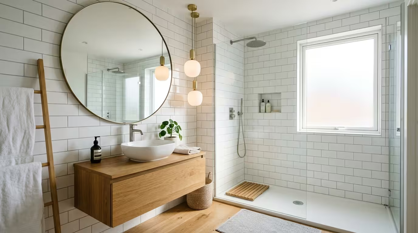
22. All-White Minimalist: An all-white palette, from walls to trim to countertops, keeps the focus on texture and materials, like fluted tile or honed stone, rather than color.
23. Black and Gold: Matte black vanities and fixtures paired with gold or brass hardware remain one of the boldest style statements for 2026, delivering contrast and a sense of polish in even a small powder room.
Bathroom Color Scheme Mistakes to Avoid
Even a well-planned bathroom color scheme can fall flat because of a few common missteps. Picking a color in isolation, without considering the tile, countertop, or flooring already in the room, often leads to clashing undertones once everything is installed together. Choosing a glossy, high-saturation color for a windowless bathroom can also make the space feel smaller rather than cozier.
Another frequent mistake is ignoring the finish. A flat or matte paint sheen absorbs moisture and stains more easily in a humid bathroom, while a satin or semi-gloss finish holds up far better and wipes clean. Pairing your wall color with one of the best bathroom countertops for your space early in the process helps every element land in the same color family before paint goes on the wall.
A third misstep is chasing every trend at once. Combining terracotta, sage green, and black hardware in the same small room can make a bathroom feel busy rather than curated. It’s usually better to pick one dominant hue, one supporting neutral, and a single metal finish, then let texture — tile shape, towel weave, a woven mirror frame — do the rest of the visual work.
Small Bathroom Color Scheme Tips That Actually Work
Small bathrooms don’t have to default to plain white. Light, warm neutrals like cream or pale blue still make a small room feel larger, but a palette built around one deeper accent wall, paired with lighter surrounding tones, adds personality without shrinking the space visually. Mirrors placed opposite the main light source double the perceived square footage, and a continuous floor-to-wall tile color removes visual breaks that make a small footprint feel choppy.
Texture matters just as much as color in a compact bathroom. A scheme that relies only on paint can feel flat, so layering in woven baskets, ceramic trays, and linen textiles gives the eye somewhere to rest. Browsing a curated set of cozy bathroom finds is an easy way to add warmth and texture to a small space without repainting anything.
Choosing Paint Finishes and Materials to Match Your Scheme
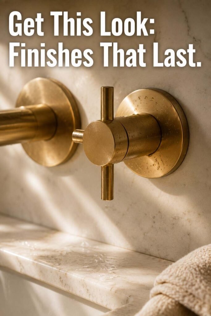
Color alone doesn’t finish a palette — the sheen and material choices carry equal weight. Satin and semi-gloss paints resist moisture better than matte finishes, making them the standard recommendation for walls, trim, and cabinetry in any bathroom. For tile and countertops, matching undertones (warm versus cool) between the wall color and the stone or porcelain prevents the mismatched, patchy look that often shows up in DIY remodels. Grout color deserves the same attention — a stark white grout can visually chop up a warm-toned tile, while a grout shade pulled from the tile itself keeps the surface reading as one continuous plane.
Metal finishes complete the palette. Brushed gold and unlacquered brass lean warm and pair naturally with cream, terracotta, and olive schemes, while chrome and matte black lean cooler and suit blues, grays, and monochrome combinations. For more curated palettes and room-by-room inspiration, outinteriors is a useful place to keep browsing before you commit to a final direction.
Conclusion
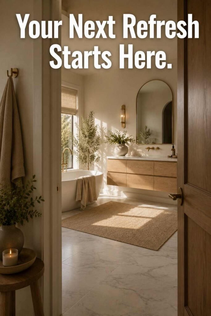
A great bathroom color scheme comes down to matching color, light, and material to the way you actually use the room. Whether you gravitate toward a warm terracotta-and-cream palette, a bold emerald-and-brass combination, or a classic black-and-white tile look, the 23 ideas above offer a starting point for nearly any style and budget. Test your top choices on the wall, check them under both daylight and vanity lighting, and build outward from there — the right palette will still feel right years from now, not just on move-in day.
Frequently Asked Questions About Bathroom Color Schemes
1. What is the most popular bathroom color scheme right now?
Warm neutrals like greige, sand beige, and warm white remain the most requested palettes because they suit almost any style and hold resale value well.
2. What colors make a small bathroom look bigger?
Pale blue, warm white, and soft cream reflect light and visually expand a small bathroom, especially when paired with a large mirror and minimal color contrast between walls and trim.
3. Should bathroom walls and cabinets be the same color?
Not necessarily. A common approach is a lighter wall color with a deeper cabinet or vanity tone, which adds depth without making the room feel closed in.
4. What paint finish is best for a bathroom?
Satin or semi-gloss finishes hold up better against moisture and are easier to wipe clean than flat or matte paint, making them the standard choice for bathroom walls and trim.
5. Are dark bathroom color schemes going out of style?
No. Deep tones like navy, forest green, and charcoal remain popular for 2026, especially in powder rooms and primary bathrooms with strong lighting to balance the darker palette.
6. How do I choose a bathroom color scheme that matches my tile?
Pull an undertone from the tile — warm beige, cool gray, or a veining color — and use that as the base for your paint and fixture choices so everything reads as one cohesive palette.
7. Do bathroom color schemes affect home resale value?
Neutral and warm-neutral palettes tend to appeal to the widest range of buyers, while bold or highly saturated schemes are best kept to smaller powder rooms rather than a primary bathroom.
8. How many colors should a bathroom palette include?
Most designers stick to three: one dominant wall or tile color, one supporting neutral, and one metal or accent tone. Adding more than three competing colors tends to make even a large bathroom feel cluttered.