
25 Color Ideas for House Exterior: Palettes, Pairings, and Pro Tips to Boost Curb Appeal
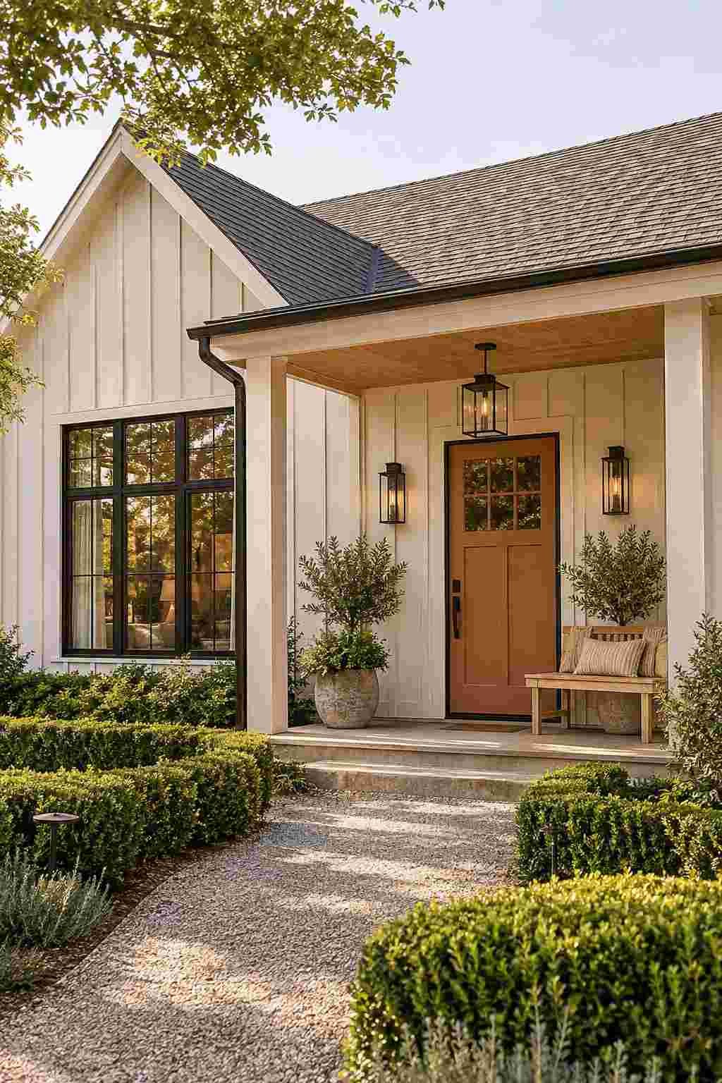
Think of the last house that made you slow down as you walked past. It probably wasn’t the biggest on the street. It was the one where the colors just felt right. The siding, trim, door, and roof worked together like a well-dressed outfit.
Paint is the fastest and most affordable way to change how a home looks and feels. A fresh coat can make a plain house look polished, or a dated one look current. This guide shares 25 color ideas for house exterior projects, grouped by style so you can find your match quickly. You’ll also learn how to test shades, avoid common mistakes, and finish the look with smart accents.
How to Narrow Down Color Ideas for House Exterior Projects
Great results start before you open a paint can. A few simple checks will save you money and regret.
Start With What Cannot Change
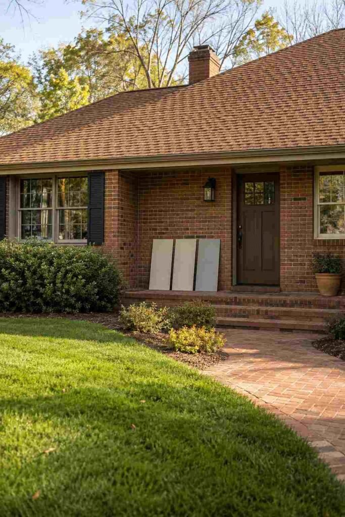
Your roof, brick, stone, and driveway are fixed features, and your paint must flatter them. Look closely at their undertones. A roof may lean warm brown, cool gray, or even slightly green. Brick often carries red or orange notes. Pick a body color that sits comfortably beside these, rather than fighting them. If you hold a sample next to the roof and one of them looks muddy, try another shade.
Test in Real Light
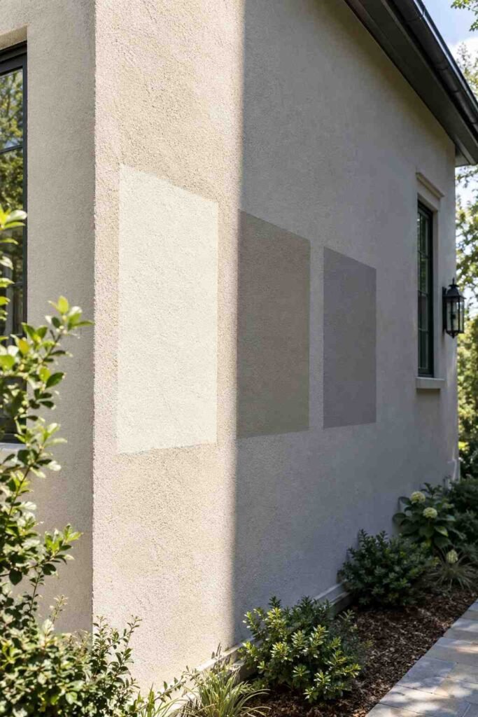
Color changes through the day. A gray that looks crisp at noon can turn bluish at dusk. Paint large sample boards, at least two feet wide, and move them around the house. Check them in morning, midday, and evening light, and on both sunny and shaded walls. Wait for the samples to dry fully, because wet paint reads differently.
Mind the Light Reflectance Value
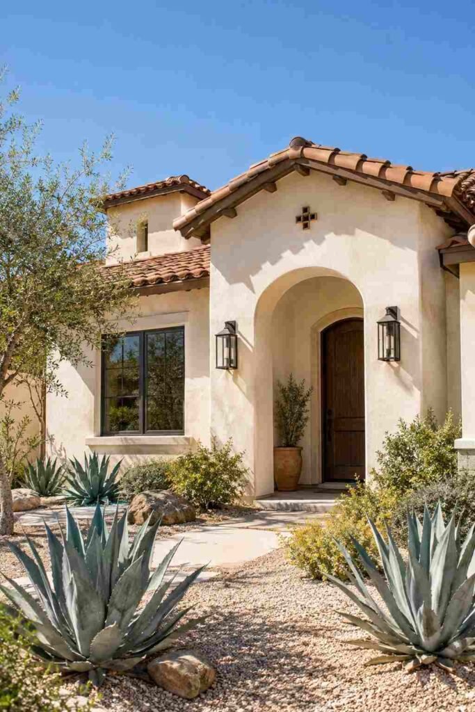
Every paint has a Light Reflectance Value (LRV) on a scale from 0 (black) to 100 (white). Lower numbers absorb more light and heat, while higher numbers reflect it. In hot climates, lighter colors can help keep walls cooler. Darker shades suit homes with deep shade or cooler weather, and they may fade faster in strong sun. Also check any neighborhood or HOA guidelines before you commit. Homeowners in sunny climates can learn more about how reflective surfaces affect indoor heat from the U.S. Department of Energy.
Classic Neutral Color Ideas for House Exterior Styles
Neutrals are popular for good reason. They age well, suit most architecture, and help a home appeal to future buyers. Once your outside is finished, carry the mood indoors with these color ideas for house interior design.
1. Warm White
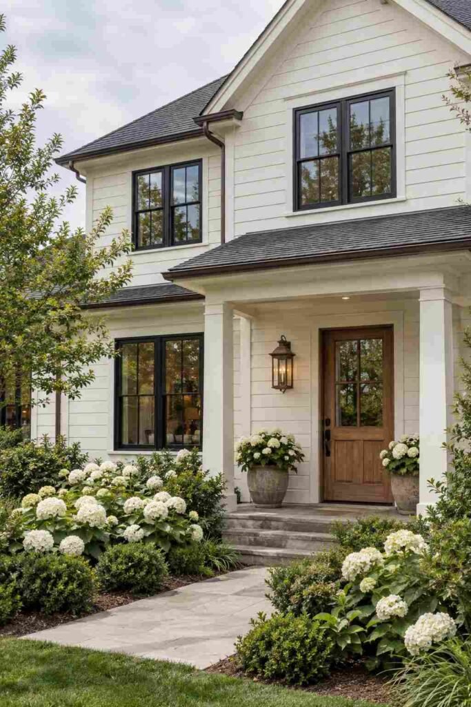
A soft white with a touch of yellow feels friendly and fresh. It brightens shaded lots and pairs well with black, bronze, or wood accents. Avoid stark, bluish whites, which can look cold outdoors.
2. Greige
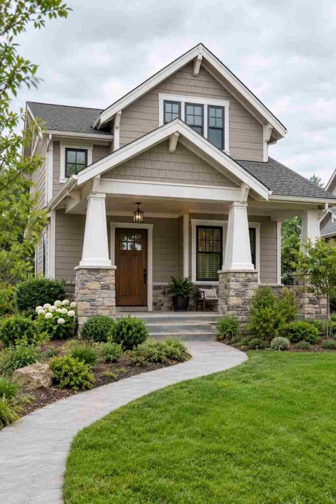
This blend of gray and beige is a modern favorite. It adapts to changing light and works with nearly any roof or stone. Choose a version with a slight warm lean to avoid a flat look.
3. Soft Gray
Light gray offers a calm, tidy look. It suits contemporary and traditional homes alike. Pair it with white trim for contrast, or charcoal trim for a more tailored finish.
4. Creamy Buttercream
A pale cream adds gentle warmth without feeling loud. It flatters brick and stucco, especially on Mediterranean and cottage-style homes. Pair it with deep green or brown shutters.
5. Charcoal
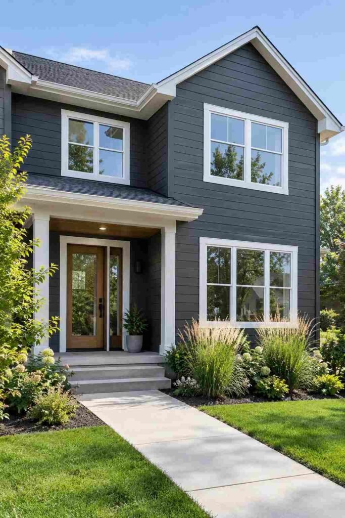
Dark gray brings drama while staying more forgiving than black. It highlights architectural lines and looks sharp with white windows. Expect it to run warmer on sunny walls.
6. Taupe
Taupe sits between brown and gray and feels grounded and earthy. It works well with natural stone and wood. Use a lighter trim to keep the house from looking heavy.
Earthy and Natural Color Ideas for House Exterior Designs
Nature-inspired shades help a home blend into its landscape. They feel relaxed, welcoming, and quietly confident.
7. Sage Green

A gray-green like sage is soothing and easy to live with. It looks lovely beside gardens and works on farmhouses, bungalows, and modern homes. Cream or white trim keeps it light.
8. Deep Forest Green
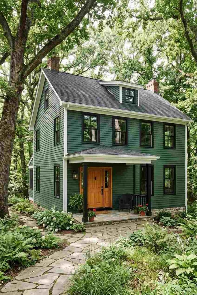
Dark green gives a home a rich, established feel. It pairs well with black windows and natural wood doors. It looks especially good among mature trees.
9. Terracotta
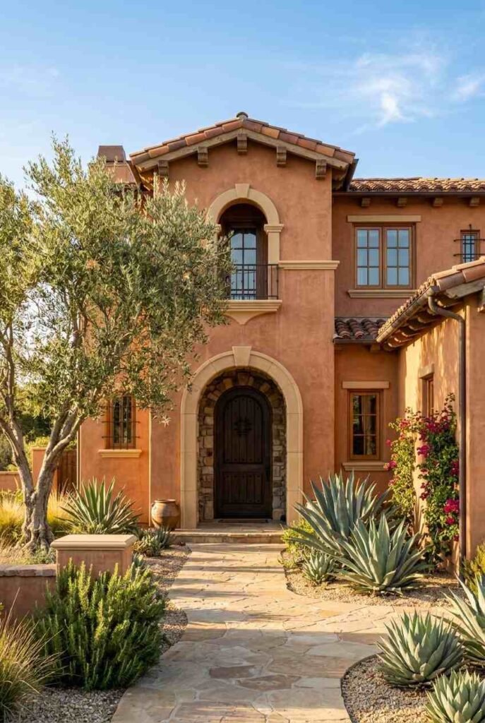
This warm clay tone suits sunny regions and Spanish or Southwestern styles. Use it on stucco for best effect. Soften it with sand-colored trim and green plants.
10. Warm Brown
Chocolate and mocha shades feel cozy and traditional. They hide dirt well and complement stone. Add cream trim so the walls don’t feel too heavy.
11. Sandstone
A sandy beige echoes desert and coastal landscapes. It’s calm and sun-friendly. Try it with white or deep blue accents for a clean, breezy look.
Bold and Dramatic Color Ideas for House Exterior Statements
If you want your home to be remembered, a deeper shade can do the job. Use quality exterior paint, and expect to touch up sun-exposed sides sooner. If you love clean, light spaces, see our entrance hall ideas for Scandinavian interior design for a welcoming first impression.
12. Classic Black
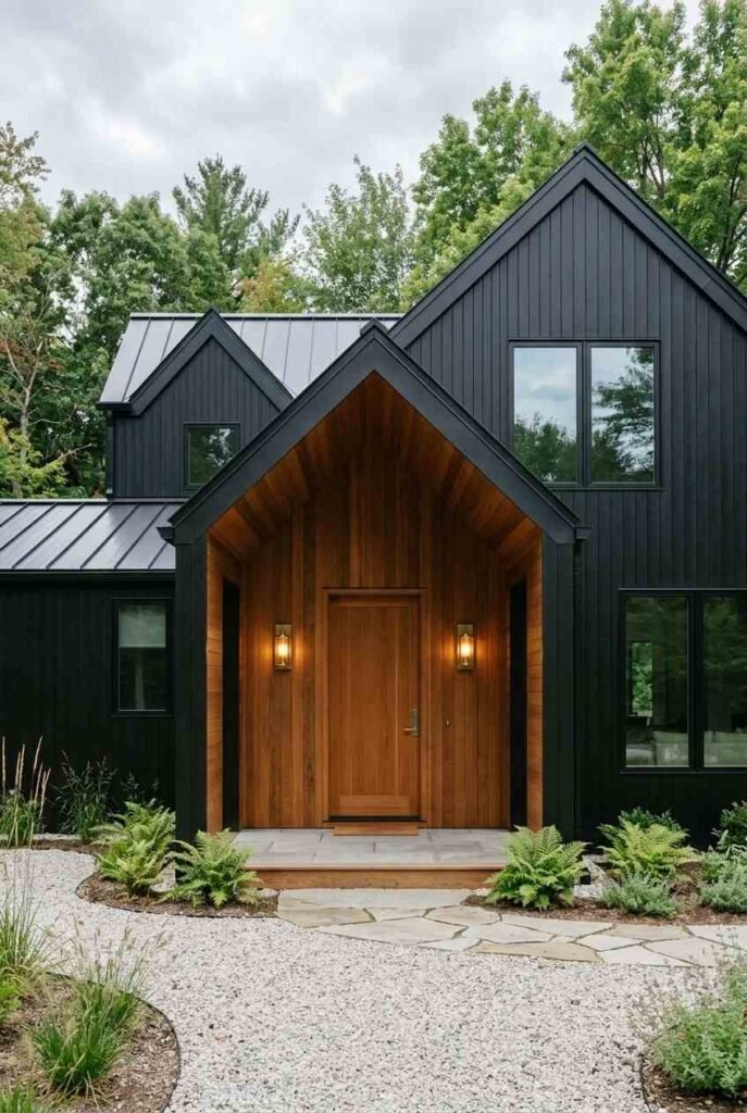
A black exterior looks sleek and modern. It makes windows, doors, and lighting stand out. Choose a satin finish and add warm wood or brass details to prevent it from feeling stark.
13. Navy Blue
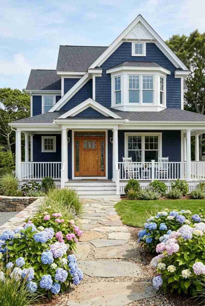
Navy is bold but timeless. It reads as nearly neutral and works beautifully with white trim. It suits colonial, coastal, and craftsman homes.
14. Deep Teal
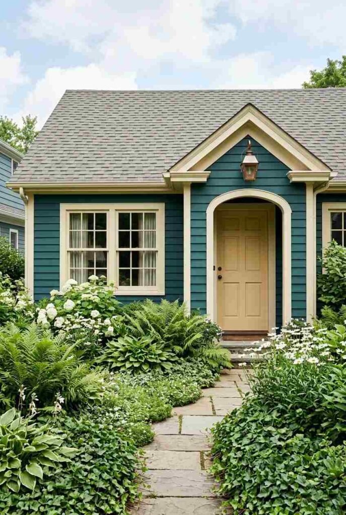
Teal blends blue and green for a lively yet sophisticated look. It stands out without shouting. Cream, white, or copper accents help it glow.
15. Burgundy
A rich wine shade adds warmth and character to a home. It works well on older or historic styles. Pair it with off-white trim and dark roofing.
16. Charcoal Blue
This slate-like shade feels moody and refined. It changes subtly with the weather, which adds interest. Light gray trim keeps it balanced.
Soft and Cheerful Color Ideas for House Exterior Charm
Gentle pastels bring personality while staying easy on the eye. They shine on cottages, beach houses, and small homes.
17. Powder Blue
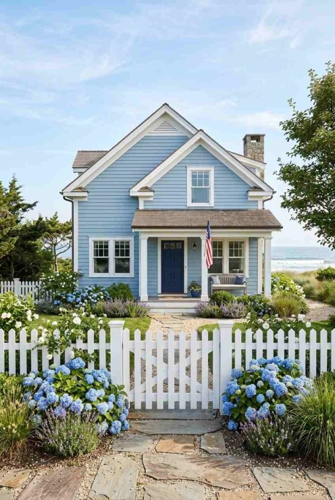
A light, airy blue echoes sky and water. It’s cheerful and calming. White trim and a navy or yellow door make it feel complete.
18. Butter Yellow
Pale yellow radiates warmth, even on gray days. Keep the shade soft rather than bright. It pairs nicely with white trim and green landscaping.
19. Blush Pink
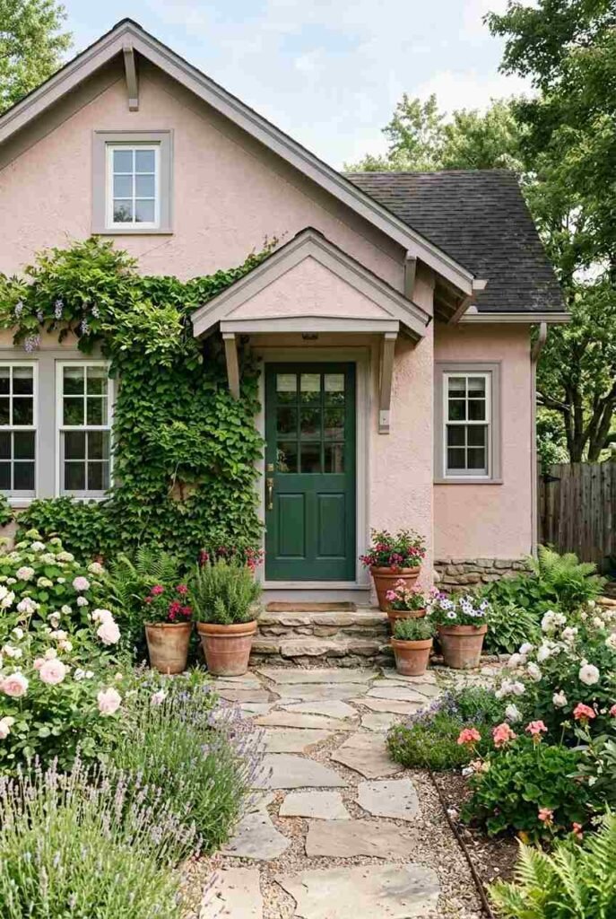
A muted, dusty pink feels unexpected and charming. It suits cottages and stucco homes. Balance it with gray or deep green accents.
20. Seafoam
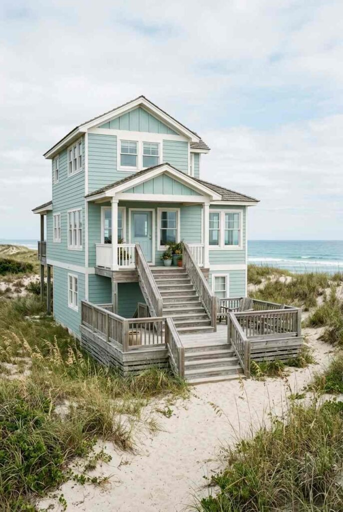
This soft blue-green evokes coastal calm. It looks fresh with white trim and natural wood. Choose a slightly grayed version for a more grown-up tone.
21. Soft Coral
A gentle coral adds sunny warmth. It works well in warm climates and with tropical plants. Use cream trim so the color feels playful, not loud.
Two-Tone Color Ideas for House Exterior Combinations
Sometimes the pairing matters more than the single shade. These combinations are proven starting points.
22. White Body With Black Trim
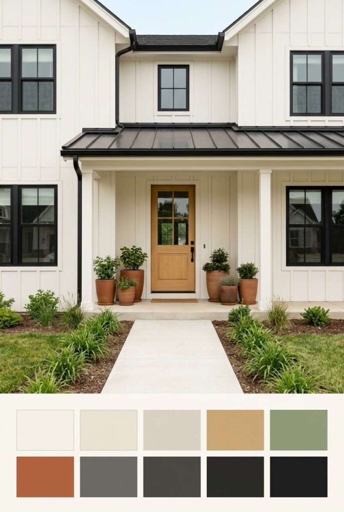
A crisp, high-contrast look that suits farmhouses and modern homes. Black windows and a matching door tie it together.
23. Gray Body, White Trim, Wood Door
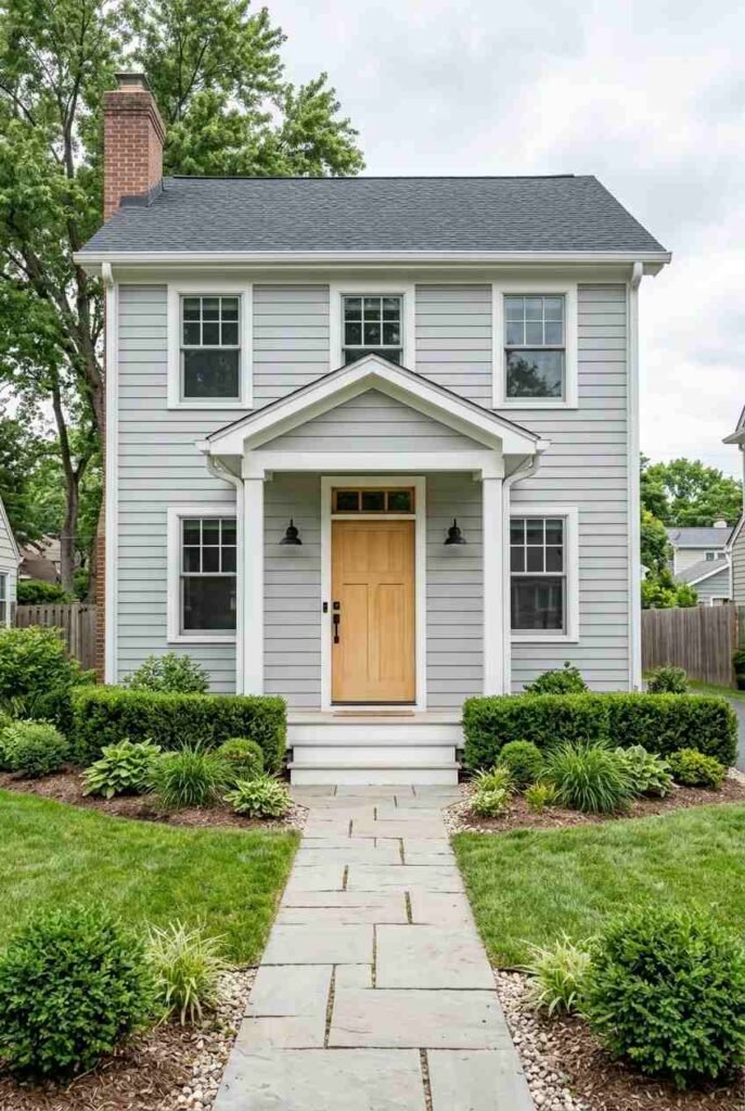
This trio feels balanced and welcoming. The natural wood door adds warmth against the cool gray.
24. Cream Body and Deep Green Trim
A traditional pairing with a storybook feel. Green shutters or a green door give a polished finish.
25. Navy Body, Warm White Trim, Brass Accents
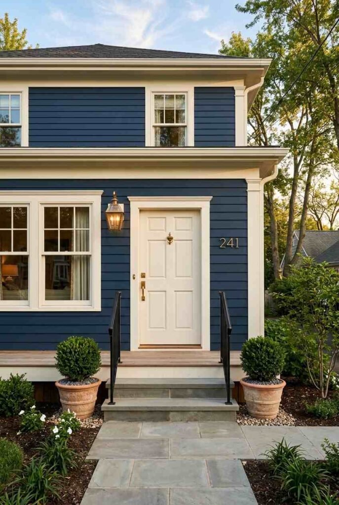
Navy gains a luxe touch from brass lighting and hardware. Warm white trim keeps the palette soft.
Finishing Touches That Complete Your Palette
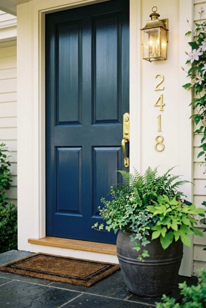
Once the main color is set, the details pull everything together. Follow the three-color rule: one for the body, one for the trim, and one for the front door or accents. This keeps the look clean and intentional.
For the finish, many painters choose satin or low-sheen for walls and semi-gloss for trim and doors, because the glossier surface resists wear and wipes clean. Light fixtures, house numbers, and the mailbox are small touches that make a big difference. Match their metal finish across the front of the house for a cohesive look. Landscaping also plays a role. Flowers and greenery add natural color, so choose paint that lets them stand out. Planning bigger changes behind the front door? Our kitchen intelligence renovation guide can help you budget wisely.
Conclusion
Choosing paint can feel like a big decision, and it is one. But it doesn’t have to be stressful. Start with your fixed features, test samples in real light, and pick a palette that suits both your home’s style and your climate. Whether you lean toward quiet neutrals, earthy greens, or a daring black, these 25 color ideas for house exterior upgrades give you plenty of tested directions. Take your time, trust your eye, and enjoy watching your home transform. For furniture and decor that suit your new look, browse the collections at outinteriors.



One Comment