Creative 26 Bedroom Color Schemes Ideas to Transform Your Sleep Space

Your bedroom is the one room in the house that answers to nobody but you. Long before furniture or decor decisions come into play, color sets the emotional tone of the space — restful, romantic, energizing, or quietly luxurious. With so many combinations to choose from, narrowing down a palette can feel overwhelming, especially as trends drift between moody jewel tones and soft, sun-washed neutrals. This guide walks through creative bedroom color schemes ideas, grouped by mood and style, along with the practical guidance designers actually use to pick a palette that fits real light, real furniture, and real life.
Why Your Bedroom Color Scheme Matters More Than You Think
Color psychology plays a real role in how a bedroom feels the moment you walk in. Cooler tones like blue and green tend to read as calming, which is part of why they show up so often in bedroom color schemes built for rest. Warmer hues like terracotta or blush can make a room feel intimate and lived-in, while high-contrast combinations energize a space that doubles as a home office. There’s no single “correct” formula — the best bedroom color scheme is the one that matches how you actually want to feel when you close the door at night. For more room-by-room palette inspiration, outinteriors is worth bookmarking.
How to Choose the Right Bedroom Color Scheme
Test Swatches in Real Light
Paint chips look different under a showroom bulb than they do in your actual bedroom. Tape large swatches to the wall and observe them in the morning, at midday, and after dark before committing. North-facing rooms tend to cast a cooler, bluish light, while south-facing rooms warm colors up — a detail that can shift a “greige” into something closer to pink or green.
Match the Palette to Room Size
Small bedrooms generally benefit from lighter, low-contrast bedroom color schemes that keep walls feeling like they recede rather than close in. Larger rooms can handle deeper, more saturated combinations without feeling heavy. If you’re just starting to explore your options, browsing a wide range of inspiring bedroom decor ideas can help you narrow down a direction before touching a paintbrush. Coastal palettes remain especially popular for smaller spaces, and a full guide to Coastal Bedroom Ideas breaks down the best blues, sandy neutrals, and driftwood accents for a beach-inspired retreat.
Follow the 60-30-10 Rule
Professional decorators lean on a simple ratio: 60% of the room in a dominant color (usually the walls), 30% in a secondary color (bedding, rugs, curtains), and 10% in an accent color (pillows, art, small decor). This rule keeps even bold bedroom color scheme ideas feeling balanced instead of chaotic.
Creative Bedroom Color Schemes Ideas by Style
Neutral & Timeless Bedroom Color Schemes
1. Warm Greige and Cream — A blend of gray and beige that reads as sophisticated without feeling cold, especially paired with cream linens and natural wood.
2. Classic Black and White — Crisp white walls with black trim, bedding, or an accent chair create a graphic, gallery-like look that never goes out of style.
3. Soft Beige and Ivory — Layered off-white tones add warmth without color, ideal for a hotel-style retreat.
4. Charcoal and Linen White — A darker, moodier neutral pairing that works especially well in primary suites with ample natural light.
5. Taupe and Alabaster — Muted, earthy, and endlessly flexible, this combination pairs equally well with brass or matte black fixtures.
Blue & Coastal Bedroom Color Schemes
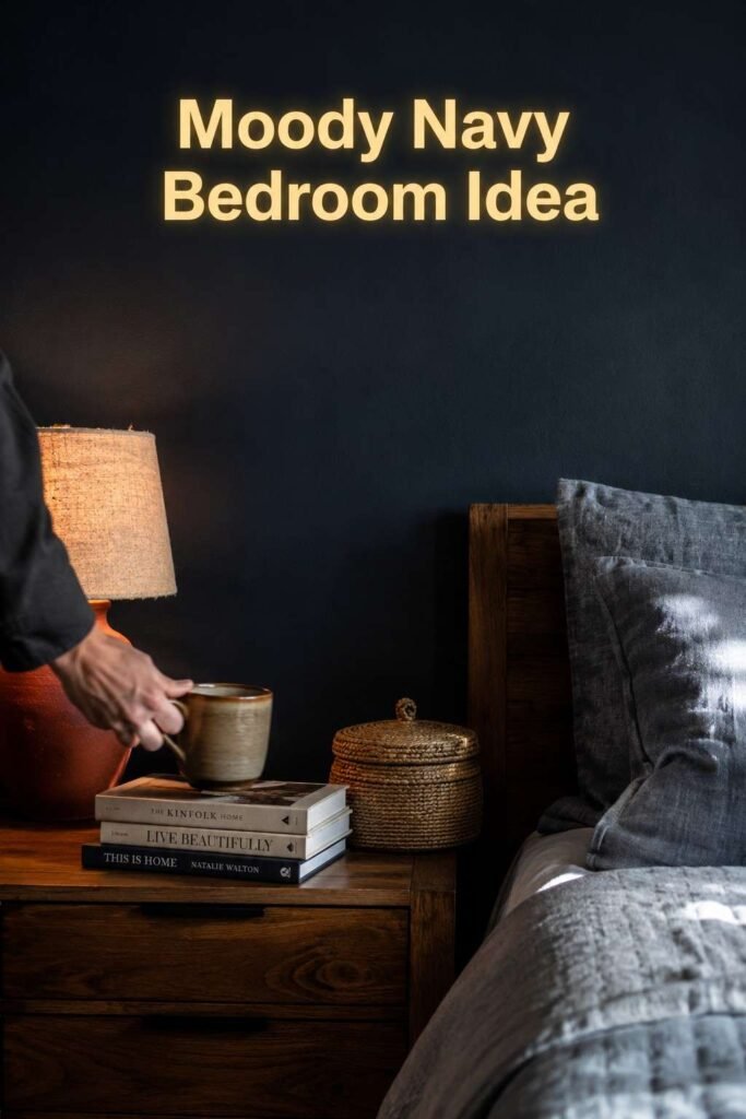
6. Navy and Rust — Deep navy walls (think Benjamin Moore’s Hale Navy) paired with rust-colored linens and a wood nightstand create a cocoon-like, grounded feel.
7. Sky Blue and White — A soft, airy pairing that mimics an open sky and works beautifully in kids’ rooms or guest bedrooms.
8. Coastal Blue and Sand — Beachy blues layered with sand-toned bedding and woven textures bring a relaxed, vacation-house energy indoors.
9. Slate Blue and Brass — A trending, sophisticated take on blue that pairs unexpectedly well with warm brass hardware.
10. Teal and Blush — An unexpected but striking combination that balances a cool jewel tone with a soft, warm accent.
Green & Earthy Bedroom Color Schemes
11. Sage Green and Terracotta — One of the most searched bedroom color scheme ideas of the past few years, this pairing feels grounded and nature-inspired.
12. Olive and Cream — A muted, sophisticated green that avoids feeling too bold or trendy.
13. Forest Green and Gold — A dramatic, jewel-toned combination best suited to primary bedrooms with strong natural or ambient light.
14. Moss Green and Natural Wood — Pairing green walls with unfinished or lightly stained wood furniture creates an organic, cabin-like atmosphere.
15. Eucalyptus and White — A soft, almost gray-green shade that feels fresh and calming without leaning too saturated.
Bold & Dramatic Bedroom Color Schemes

16. Emerald Green Accent Wall — Rather than committing to four walls, an emerald accent wall behind the headboard adds drama with less risk.
17. Deep Burgundy and Cream — A rich, romantic pairing that works especially well in rooms with minimal natural light, where the depth of color feels intentional rather than dark.
18. Plum and Blush Pink — Two warm, saturated tones that read as moody and feminine without feeling overly sweet.
19. Midnight Blue and Copper — A striking, almost celestial combination that pairs well with metallic accents and layered textiles.
20. Black and Gold Glam — A high-contrast, luxury-leaning palette best balanced with plenty of soft textiles to offset the drama.
Soft & Romantic Bedroom Color Schemes
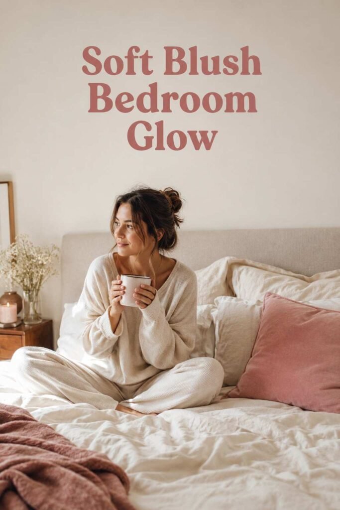
21. Blush Pink and Ivory — A gentle, versatile pairing that works in both feminine and gender-neutral spaces.
22. Lavender and White — A pastel pairing associated with calm and relaxation, particularly effective in rooms used primarily for sleep.
23. Dusty Rose and Sage — Two muted, slightly desaturated tones that pair surprisingly well and feel current without chasing a fleeting trend.
Warm & Cozy Bedroom Color Schemes
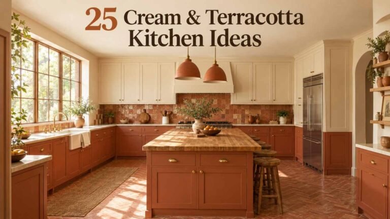
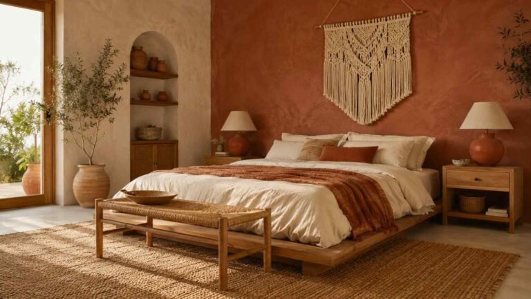
24. Terracotta and Cream — Earthy and sun-baked, this combination brings warmth to rooms that lack strong natural light.
25. Mustard and Charcoal — A bold but grounded pairing, best used sparingly through bedding or an accent chair rather than full walls.
26. Rust and Warm Gray — A modern, autumnal palette that feels cozy in cooler months without becoming overpowering in summer.
Bedroom Color Trends Gaining Momentum in 2026

Heading into 2026, designers are leaning toward nature-inspired neutrals — think creamy mushroom, warm greige, and soft sage — alongside a continued appetite for deep, moody tones like charcoal and navy in primary suites. Slate blue has also emerged as a standout, offering the calm of a traditional blue bedroom color scheme with a more sophisticated, less predictable edge. The common thread across most trending palettes is restraint: fewer stark whites, more layered, warm-toned neutrals paired with a single confident accent color.
Common Mistakes to Avoid When Choosing a Bedroom Color Scheme
One of the most frequent mistakes is choosing a color from a small paint chip rather than a larger sample on the actual wall, which can lead to unpleasant surprises once a full room is painted. Another is ignoring the room’s natural light orientation, which can shift how warm or cool a color appears throughout the day. Finally, many people underestimate how much bedding, rugs, and curtains contribute to the overall palette — a wall color is only one piece of a complete bedroom color scheme, not the entire equation.
Final Thoughts
There is no universal “best” color for a bedroom — only the palette that matches how you want the room to feel and function. Whether you’re drawn to a calming coastal blue, a dramatic emerald accent wall, or a soft, romantic blush and ivory pairing, these creative bedroom color schemes ideas offer a starting point for a space that feels distinctly yours. Test your top choices in real light, keep the 60-30-10 rule in mind, and let the rest of the room’s furnishings do the finishing work.
Frequently Asked Questions
What is the most popular bedroom color scheme right now?
Sage green paired with terracotta or warm neutrals like greige and cream are currently among the most popular choices, largely because they feel calming without being flat or boring.
What color scheme makes a small bedroom look bigger?
Light, low-contrast palettes — such as soft blue and white, or beige and ivory — help small bedrooms feel more open, since they reflect more light and reduce visual weight on the walls.
Should bedroom walls and ceiling be the same color?
Not necessarily. A slightly lighter shade on the ceiling can make a room feel taller, while painting the ceiling the same color as the walls creates a cozy, enveloping effect that works well in smaller or darker rooms.
What colors help with better sleep?
Cooler, muted tones like soft blue, sage green, and lavender are generally associated with relaxation and are frequently recommended for bedrooms specifically used for sleep rather than multipurpose spaces.
Is it better to use bold colors on all four walls or just one accent wall?
An accent wall is a lower-commitment way to test a bold color before painting an entire room, and it also adds visual interest without overwhelming the space, particularly behind a headboard.
How do I choose a bedroom color scheme for a shared or guest room?
Stick to versatile, calming neutrals or soft blues and greens, since these tend to appeal to a broader range of tastes and won’t feel overly personal to any one occupant.
Do dark bedroom colors make a room feel smaller?
Not always. In rooms with good natural light or high ceilings, dark colors like charcoal or navy can feel intentional and cozy rather than cramped, especially when balanced with lighter textiles and metallic accents.