
30 Color Ideas for House Rooms That Feel Calm, Warm, and Welcoming
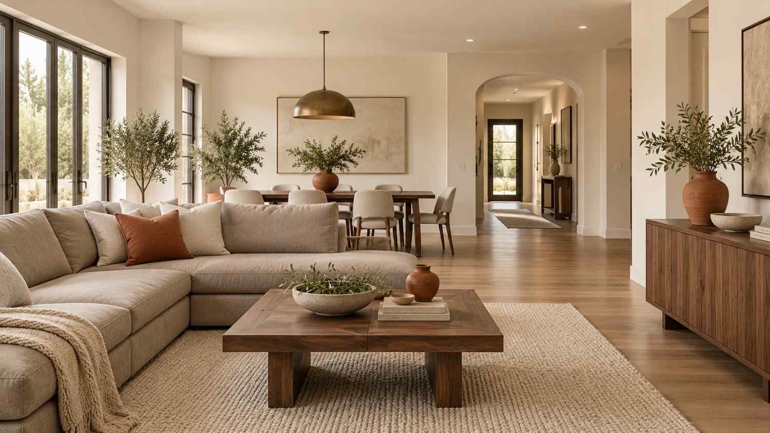
Color is the cheapest way to change how a home feels. A single can of paint can make a small room feel open, a cold room feel warm, or a plain front door feel welcoming. Yet picking a shade is hard. Samples look different at noon than at dusk, and a color that works in a magazine may fall flat in your hallway.
This guide brings together 30 color ideas for house projects, grouped by mood. You will find real paint names, easy pairings, and short tips from common design practice. Use it to narrow your choices before you buy a single sample.
How to Choose from These 30 Color Ideas for House Makeovers
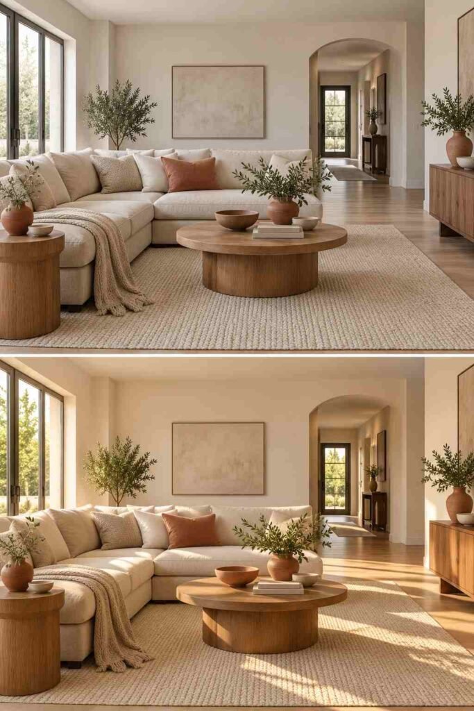
Start with light. North-facing rooms get cool, steady light, so warm shades keep them from feeling gray. South-facing rooms get warm light all day and handle cooler tones well. Always test a color on two walls and look at it in the morning, afternoon, and at night.
Next, check the undertone. Whites, grays, and beiges lean yellow, pink, blue, or green. Hold your sample next to a pure white sheet of paper to see the hidden tint.
Finally, use the 60-30-10 rule. Let one main color cover about 60% of the space, a second take 30%, and an accent fill the last 10%. It keeps any palette balanced. Also check the light reflectance value (LRV) on the paint can. The scale runs from 0 (black) to 100 (white), and higher numbers bounce more light into a room.
Warm Neutral Color Ideas for House Living Rooms and Bedrooms
Neutrals are the safest starting point, and they are far from boring. Today’s versions have more warmth and depth than the cold grays of a decade ago.
1. Soft Greige
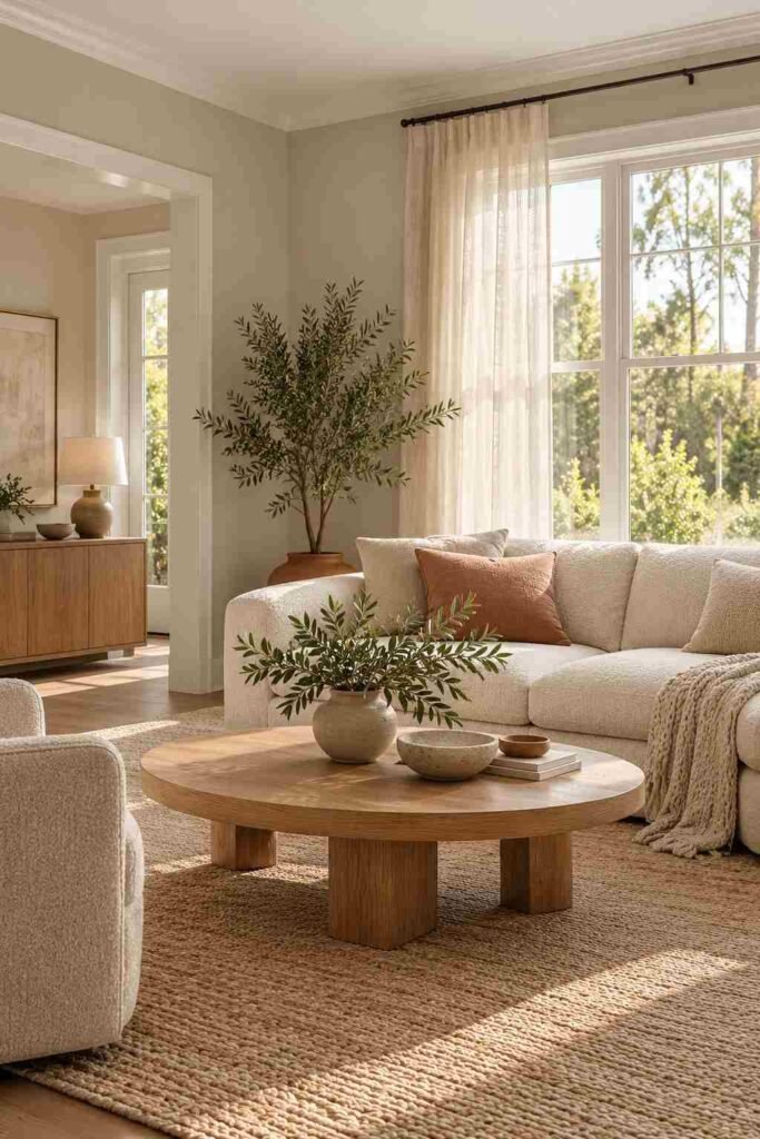
Greige blends gray and beige. Sherwin-Williams Agreeable Gray (SW 7029) is a long-time favorite. It suits open-plan homes because it shifts gently between rooms. Pair it with white trim and natural wood.
2. Creamy White
Benjamin Moore Simply White (OC-117) is a warm, clean white. It reflects light well and makes small rooms feel larger. Use it on walls, ceilings, and trim for a calm, unified look.
3. Warm Mushroom
Mushroom sits between taupe and gray. It adds quiet depth without darkening a room. Try it in bedrooms with linen bedding, brass lamps, and soft wool throws.
4. Beige and Black
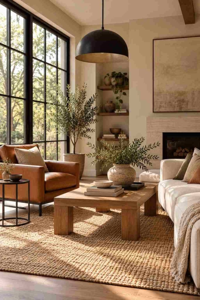
Beige walls with black window frames and black light fixtures feel modern and grounded. For a full example, see this beige and black living room. Sherwin-Williams Accessible Beige (SW 7036) is a dependable wall color for this look.
5. Cloud White
Pantone named Cloud Dancer its 2026 Color of the Year, a soft, airy white. It works as a gallery-style backdrop for art and colorful furniture.
Green Color Ideas for House Calm and Freshness
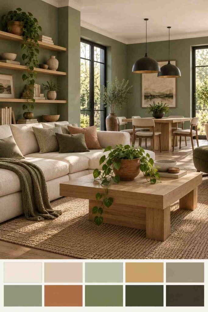
Green connects indoor spaces to nature. It works in nearly every room and every light.
6. Sage Green
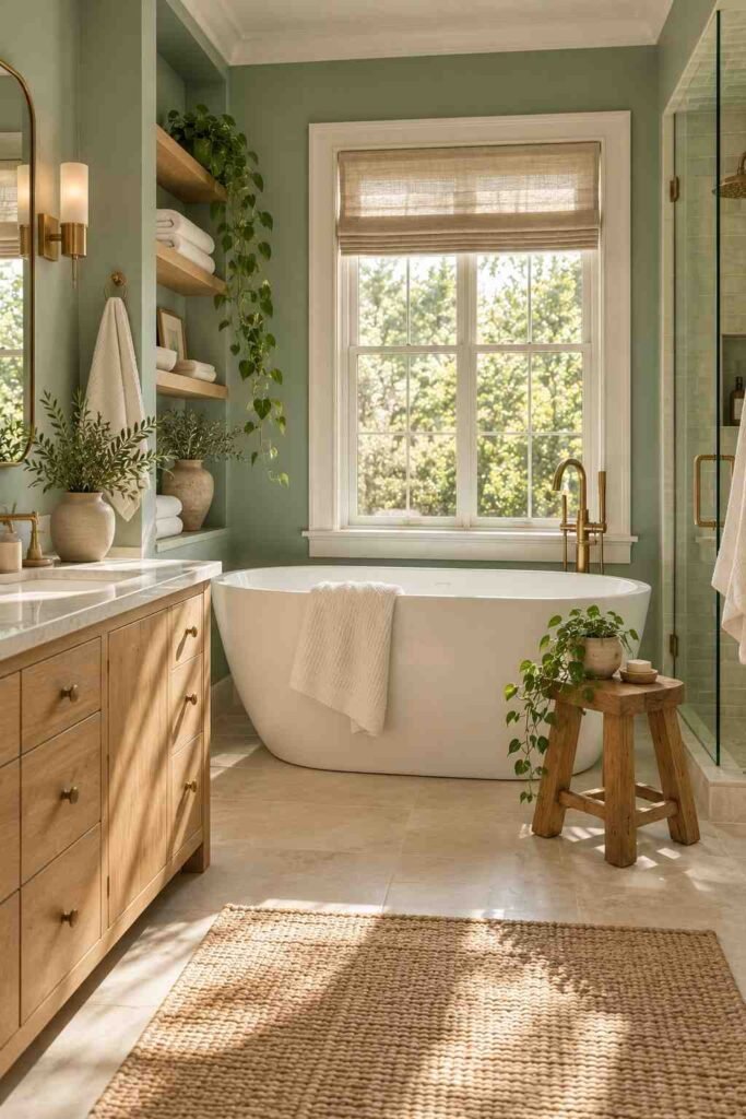
Sage is a gray-leaning green that feels restful. Sherwin-Williams Sea Salt (SW 6204) shifts between green and blue depending on the light. It is excellent in bathrooms and bedrooms.
7. Olive Green
Olive has an earthy, slightly golden tone. Use it on kitchen cabinets with brass hardware. It looks rich beside walnut and oak.
8. Deep Forest Green
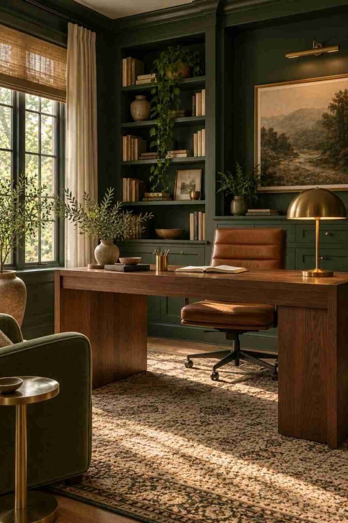
Dark green creates a cozy, library-like mood. Sherwin-Williams Evergreen Fog (SW 9130) is a softer take. Use it in a study or dining room with warm lighting.
9. Sage Green and Terracotta
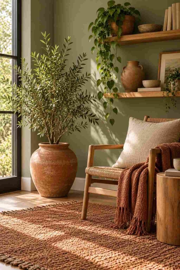
These two colors share an earthy character. A sage wall with terracotta pots, rugs, or pillows feels natural and relaxed. For more inspiration, browse these sage green and terracotta decor pairings.
10. Mint and White
Mint is light and playful. Keep it in small doses, such as a pantry, laundry room, or child’s bedroom, and let white trim keep it crisp.
Blue Color Ideas for House Serenity and Contrast
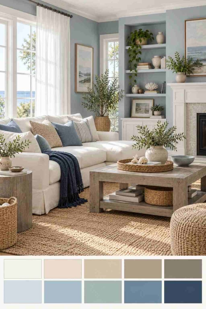
Blue lowers visual noise. It ranges from airy and coastal to deep and dramatic.
11. Navy Blue
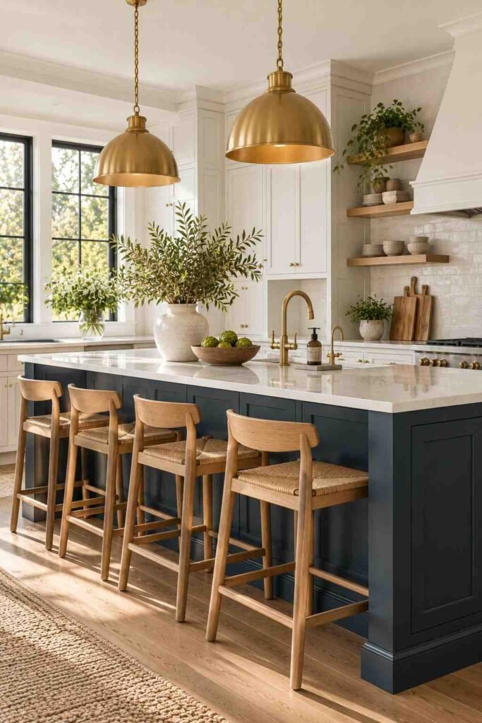
Benjamin Moore Hale Navy (HC-154) is a classic. It looks sharp on a front door, kitchen island, or bedroom accent wall. Pair it with white, brass, or warm wood.
12. Powder Blue
Powder blue brightens nurseries and bathrooms. It reads soft rather than sugary when paired with cream and light oak.
13. Slate Blue
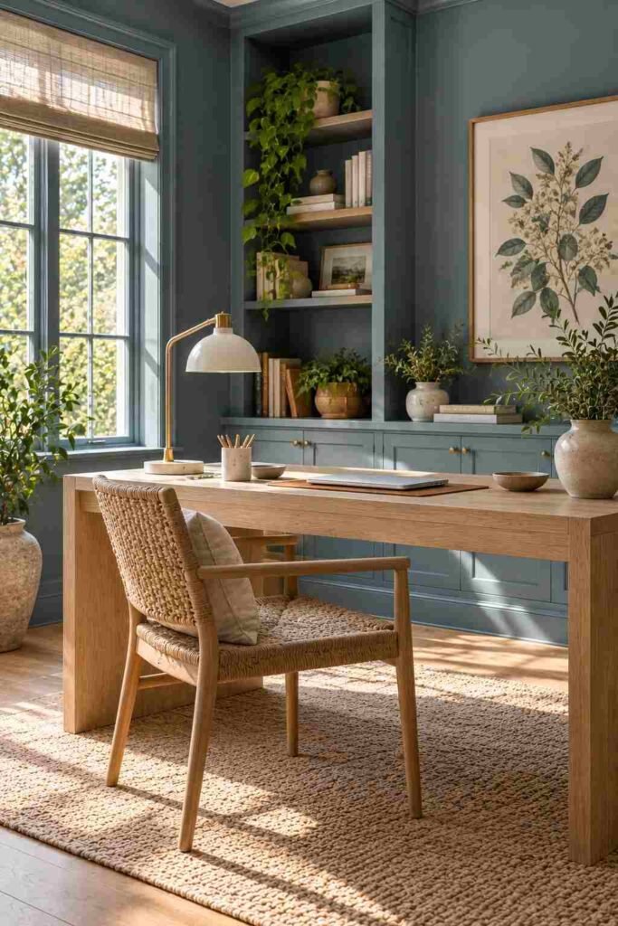
Slate blue has a gray base, so it feels grown-up and calm. It suits home offices where you need focus.
14. Teal
Teal adds energy. Use it on one wall, a bookcase, or a vanity. Keep furnishings neutral so the color stays the star.
15. Sky Blue Ceiling
Painting a porch or bedroom ceiling a pale blue is a traditional trick. It adds a sense of open air overhead.
Earthy and Terracotta Color Ideas for House Kitchens and Dining Rooms
Earth tones feel welcoming, which is why they suit rooms where people gather.
16. Terracotta
Terracotta is a burnt orange-brown rooted in clay pottery. Sherwin-Williams Cavern Clay (SW 7701) is a popular choice. Use it on an accent wall or arched doorway.
17. Cream and Terracotta
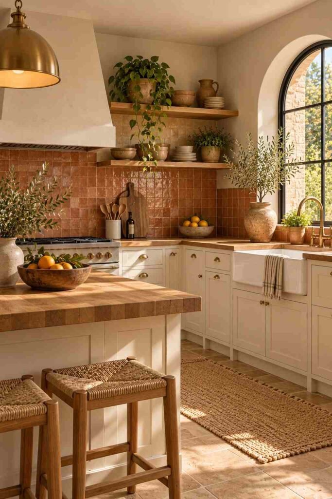
Cream softens terracotta’s intensity. The pair works well in cooking spaces with open shelves and wood tools. See how it looks in a cream and terracotta kitchen.
18. Sunflower Yellow
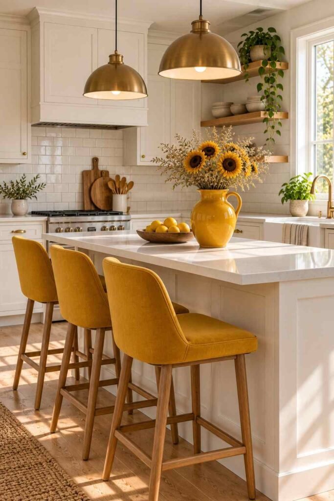
A warm yellow cheers up a small kitchen. Use it in accents such as stools, tiles, or a single cabinet run. For styling help, try these sunflower kitchen decor ideas for modern layouts.
19. Camel and Caramel
Camel tones feel like leather and wood. Use them on lower walls or built-ins. They pair well with cream, black, and deep green.
20. Dusty Rose
Dusty rose is a muted pink with a brown base. It reads sophisticated in bedrooms and dining rooms, especially with brass and olive.
Bold and Dark Color Ideas for House Statement Spaces
Dark colors need confident use, but they reward you with depth and drama.
21. Charcoal
Charcoal walls make white trim and art stand out. Sherwin-Williams Tricorn Black (SW 6258) is a near-black option for doors and trim.
22. Deep Plum
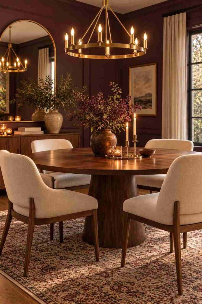
Plum feels luxurious in a dining room or powder room. Add candlelight or warm bulbs to bring out its richness.
23. Urbane Bronze
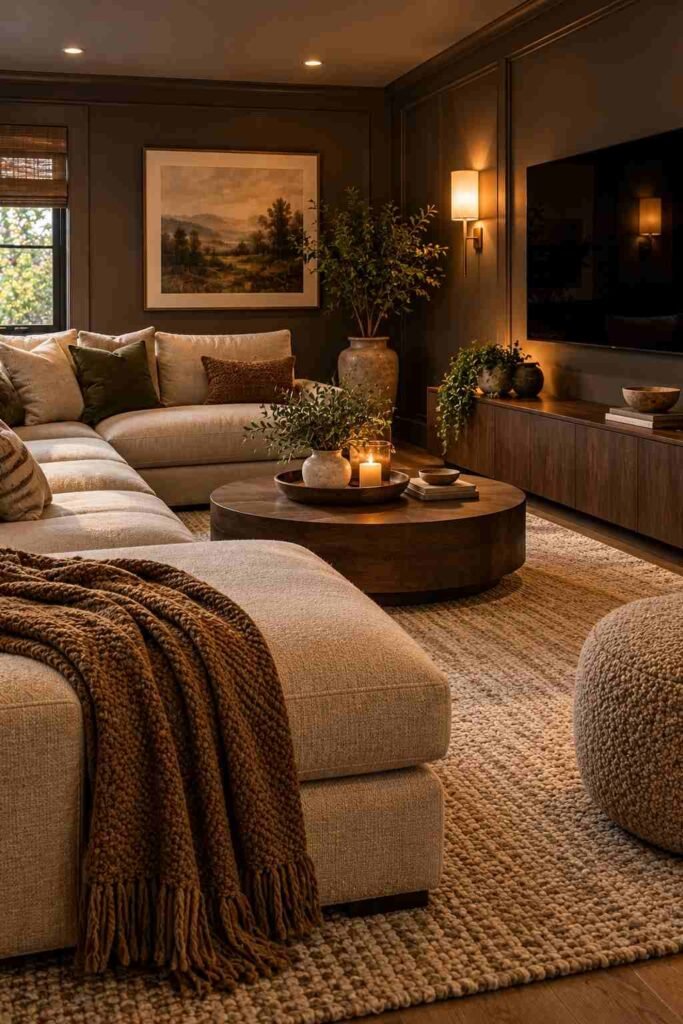
Sherwin-Williams Urbane Bronze (SW 7048) is a dark, warm brown-gray. It gives a media room a cozy, enveloping feel.
24. Burgundy
Burgundy is a wine-red with a brown edge. It looks best in small, enclosed rooms like studies, paired with leather and wood.
25. Moody Navy and Black
Layer navy walls with black fixtures for a high-contrast look. Keep a light rug or pale curtains so the room does not feel heavy.
Exterior Color Ideas for House Curb Appeal
Many guides skip the outside. Yet the exterior sets the first impression, and the right palette also needs to suit your roof, brick, and landscaping.
26. Classic White with Black Trim
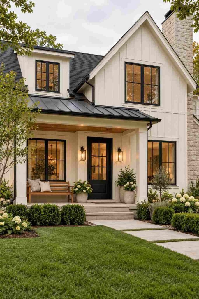
White siding with black windows is the well-known modern farmhouse look. Sherwin-Williams Alabaster (SW 7008) is a soft, warm white that avoids stark glare.
27. Greige Siding
A greige exterior blends with most landscapes and roofs. Add a navy or deep green door for a polished pop.
28. Sage or Olive Siding
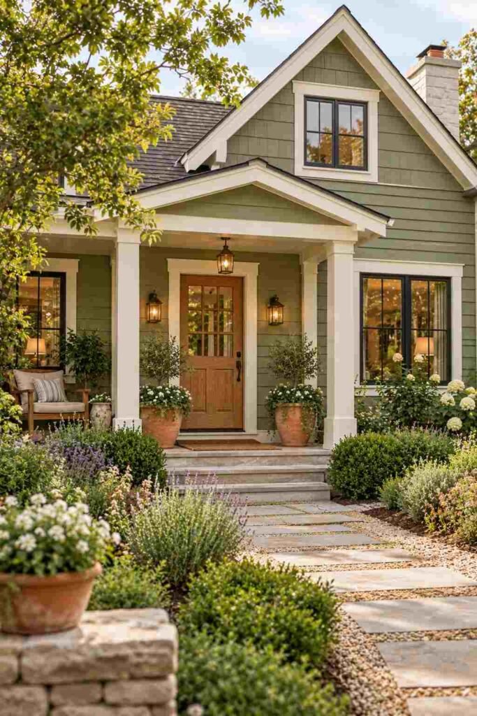
Muted greens help a home settle into its yard. Pair with cream trim and a natural wood door.
29. Dark Charcoal or Black
Dark exteriors look striking, though they absorb more heat. Choose them with care in hot climates, and match them with light-colored roofs when you can.
30. Warm Terracotta Accents

Warm clay-toned painted brick or stucco suits Spanish and Southwestern styles. Pair with cream trim and wrought iron.
How to Combine These Color Ideas for House Palettes
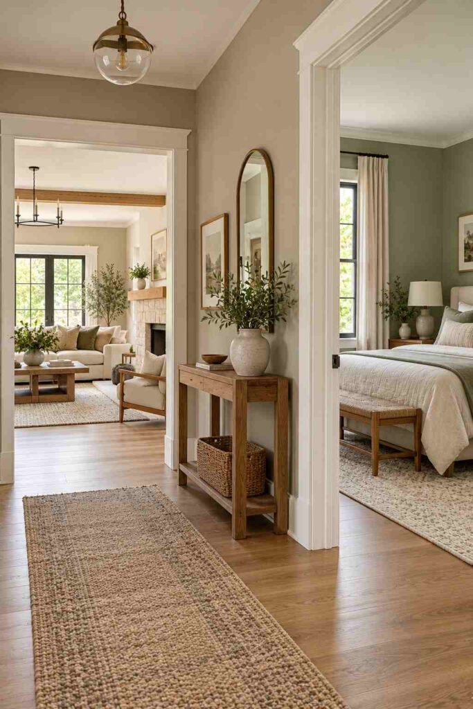
You do not need to use every idea in one home. Pick a main color, a supporting color, and an accent. Keep undertones consistent: warm with warm, cool with cool.
Think about flow, too. Rooms you can see from one another should feel related. A calm greige can run through the hall, living room, and kitchen, while bedrooms and baths hold the bolder shades. For inspiration on pulling a whole look together, Outinteriors shares room-by-room styling.
Finally, mind sheen. Matte hides wall flaws. Eggshell suits living areas. Satin or semi-gloss handles moisture and wear in kitchens, baths, and trim.
Common Mistakes to Avoid
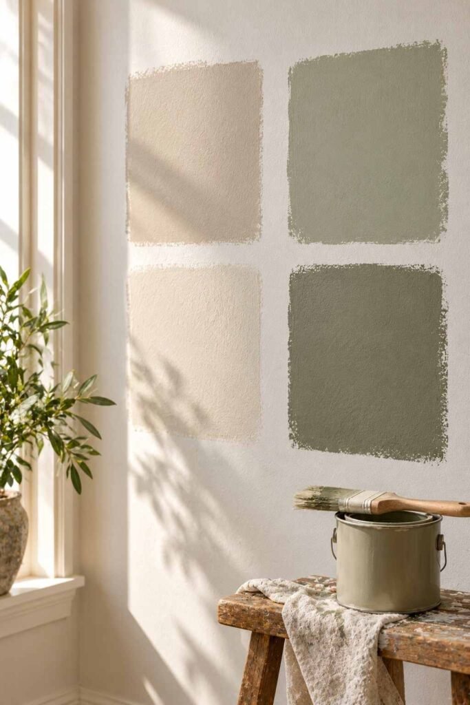
Skipping samples is the biggest error. Paint 2-by-2-foot patches, not tiny swatches. Another mistake is ignoring fixed elements such as flooring, counters, and brick. Their undertones will clash with the wrong paint.
Also avoid choosing a color from a screen. Monitors change shades. Finally, do not forget the ceiling. A slightly lighter version of the wall color often looks more refined than stark white.
Conclusion
Good color makes a home feel like yours. Start with the light in each room, check undertones, and test samples. Use these 30 color ideas for house interiors and exteriors as a menu, not a rulebook. Mix a calm neutral with one confident accent, and your space will feel balanced and personal.