Malachite Spring Trending Color: How to Use This Rich Green at Home
Spring color usually arrives softly. We expect pale blue, blush pink, butter yellow, or a garden shade of sage. Then a color like malachite walks in and changes the mood. The malachite spring trending color is not shy, flat, or barely there. It is a rich jewel green inspired by the natural mineral known for vivid green banding, depth, and a polished stone-like presence. In a home, it can feel fresh, dramatic, grounded, and elegant at the same time.
What makes this shade different from ordinary green is its balance of energy and maturity. It has the brightness people want in spring, but it also has the depth that keeps a room from feeling childish or temporary. This vivid green works because it connects two strong design desires: people want more expressive homes, but they still want rooms that feel calm, intentional, and livable.
Why the Malachite Spring Trending Color Feels Right for Spring
Malachite feels right for spring because it carries the visual language of renewal without looking predictable. Instead of a soft botanical green, it brings the deeper side of nature into the room. Think glossy leaves after rain, garden gates, vintage glass, polished stone, and shaded landscapes. This makes the shade a smart choice for people who want seasonal freshness without repainting their home in a pastel palette.
Another reason it feels current is that homeowners are moving away from spaces that feel too flat or overly safe. Beige, white, and gray still have their place, but many rooms now need a stronger accent to feel personal. Malachite gives that contrast. It can sit beside warm neutrals, natural wood, brass, stone, cream upholstery, and woven textures without fighting them.
The color also suits the way people actually decorate. Not everyone wants a full green room. Malachite can appear in a lamp, mirror frame, vase, painted cabinet, tile wall, artwork, velvet chair, or throw pillow. That flexibility makes malachite useful for renters, homeowners, and anyone testing richer colors for the first time.
What Is Malachite Green?
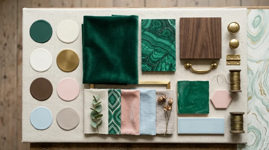
Malachite green is inspired by malachite, a copper carbonate mineral known for its bright green color and natural bands of lighter and darker tones. The stone has been used in decorative objects, jewelry, carved pieces, and historical interiors because it has a luxurious visual depth that plain green surfaces often lack. In decor language, malachite usually refers to a saturated green that can range from emerald-like brightness to darker blue-green richness.
The key is depth. A true malachite-inspired shade should not look neon, minty, or muddy. It should feel alive, layered, and slightly polished. That is why malachite works best when it is paired with thoughtful materials. Gloss paint, glazed tile, lacquer, velvet, marble, aged brass, walnut, and ceramic all help bring out its stone-like character.
For a wall color, malachite may need to be adjusted depending on the light. In a sunny room, it can look brighter and more energetic. In a north-facing room, it may read more deeply and more dramatically. Testing a large sample is important before committing, especially if you plan to use it on cabinets, trim, or all four walls.
Why Designers Are Paying Attention
The design appeal of malachite comes from its range. It can feel traditional in a historic bathroom, modern on lacquered cabinetry, artistic in a gallery-style living room, and playful in a child’s room when used carefully. It is dramatic, but not random. It has enough history and natural reference to feel lasting.
Current color directions also support its rise. Rich greens, earthy neutrals, teal-based shades, warm browns, and stronger accent colors are all appearing across interiors. Malachite sits beautifully in that world. It is bolder than sage, more refined than lime, fresher than forest green, and more decorative than olive. It also pairs well with the warmer neutral palettes many homes already have.
This is why the shade can work beyond spring. A pale seasonal color may feel dated after a few months, but malachite has year-round strength. In spring, it looks fresh with cream, linen, and floral patterns. In fall and winter, it becomes deeper beside leather, dark wood, bronze, burgundy, and chocolate brown.
The Mood Malachite Creates in a Room
Color changes the way a room feels before anyone notices the furniture. Malachite creates a feeling of collected confidence. It is not as quiet as sage and not as formal as navy. It adds presence, but it can still feel natural because green is familiar to the eye. Used well, malachite creates a focal point in a room without making it feel chaotic.
In a small room, it can make the space feel jewel-like rather than cramped. In a large room, it can anchor pale upholstery and open floor plans. In a bedroom, it brings cocooning depth. In a kitchen, it adds freshness to everyday surfaces. In a bathroom, it can feel clean, glossy, and spa-like when balanced with white, brass, and stone.
The emotional tone depends on the finish. Matte malachite feels softer and more grounded. High-gloss malachite feels glamorous and reflective. Velvet makes it look plush. Ceramic tile makes it look architectural. Painted wood gives it a tailored look. The color itself is strong, but the material decides whether the room feels relaxed, dramatic, vintage, or modern.
Best Rooms for Malachite Green
Living Room
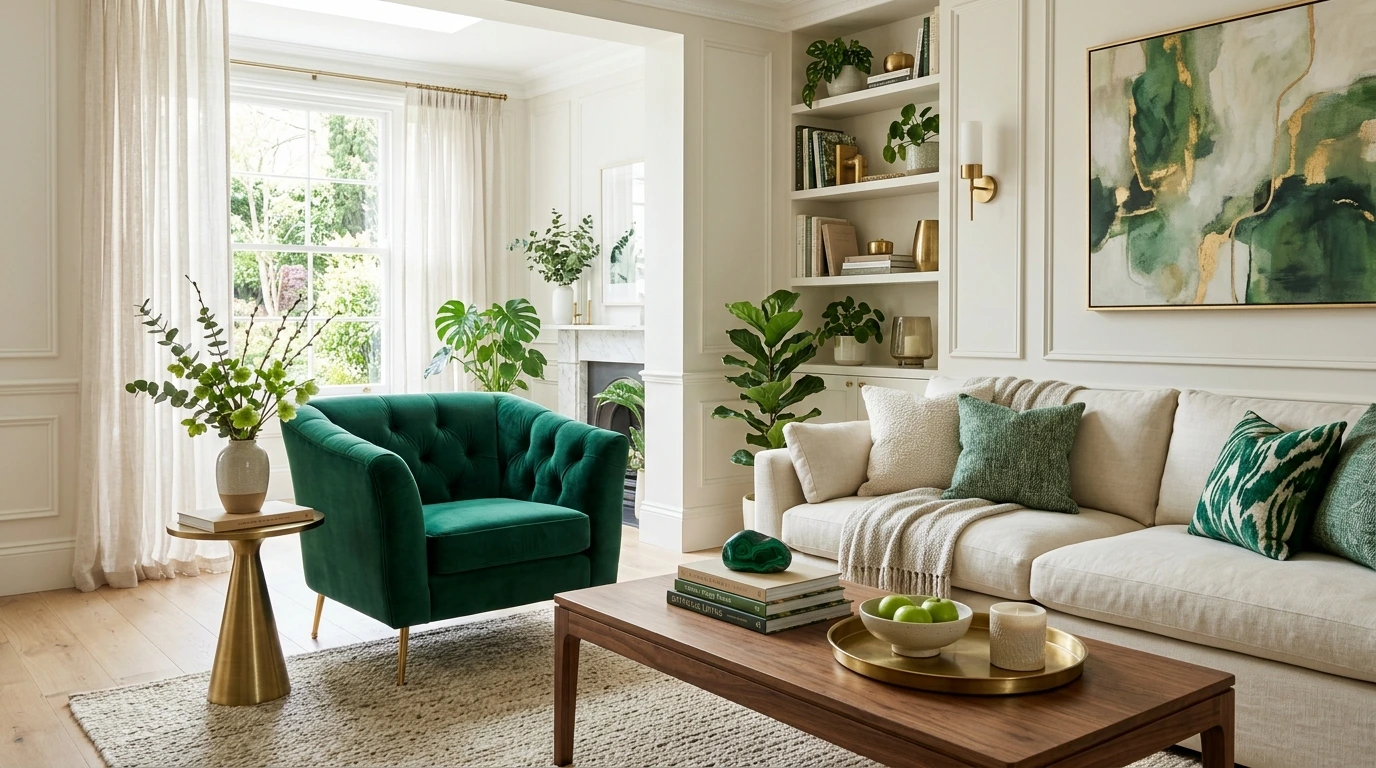
A living room is one of the easiest places to try malachite because the color can be introduced without a permanent change. Start with a pair of pillows, a ceramic lamp, a large botanical artwork, or a patterned rug with green details. If the room has neutral walls, malachite can instantly sharpen the space and make existing furniture look more intentional.
For a bolder approach, consider one malachite accent chair or a painted bookcase. A bookcase works especially well because books, brass objects, and framed photos break up the color. If you use malachite on a wall, keep the surrounding palette calm. Cream, warm white, taupe, walnut, cognac leather, and black accents can make the shade feel sophisticated rather than loud.
You can also compare malachite with other living room paint color ideas before updating your main seating area.
Bedroom
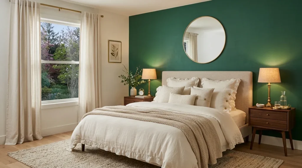
In a bedroom, malachite works best when it feels restful instead of theatrical. Use it behind the bed, on bedside lamps, in patterned bedding, or through velvet curtains. The goal is to create depth without making the room feel heavy. This green pairs beautifully with ivory bedding, warm wood, antique gold, soft blush, and natural linen.
A malachite headboard can be a strong but controlled focal point. If you prefer paint, try the wall behind the bed first rather than the whole room. Add warm light through lamps instead of relying only on overhead lighting. This keeps the green from looking too sharp at night and helps the room feel comfortable.
For more playful palettes, explore these colorful bedroom decorating ideas before choosing your final accents.
Kitchen
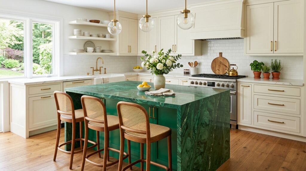
A kitchen can handle malachite when the color is placed on elements with clean lines. Cabinetry, an island, bar stools, open shelving, or a tile backsplash can all work. The shade looks especially polished with marble-look counters, soapstone, white quartz, unlacquered brass, and warm wood flooring. In this setting, malachite feels fresh but substantial.
For small kitchens, consider painting only the lower cabinets or the island. This gives the room weight while keeping the upper area bright. If you already have white cabinets, malachite bar stools, pendant lights, or a patterned runner can bring the trend in without a renovation. Avoid pairing it with too many competing bright colors unless the room is intentionally maximalist.
Bathroom and Powder Room
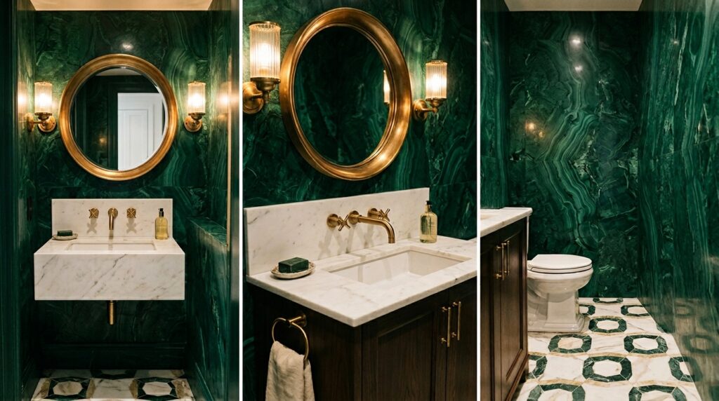
Bathrooms are ideal for rich color because they are usually smaller and more contained. A malachite vanity, glossy green tile, or patterned wallpaper can make a powder room memorable. Malachite works particularly well in bathrooms because its mineral inspiration feels connected to stone, water, and polished surfaces.
For a classic look, pair it with white tile, marble, brass, and a warm mirror frame. For a modern look, use it with black fixtures, large-format tile, and simple lighting. If the bathroom has no natural light, choose a finish with some sheen. Glossy surfaces bounce light around and help the shade feel alive rather than flat.
If your space is compact, this guide to green paint small rooms can help you choose the right shade and finish.
How to Pair Malachite with Other Colors
The easiest pairing is malachite with warm white. This keeps the room fresh and lets the green stand out. Cream, ivory, and soft white are usually better than stark white because malachite has richness, and a warmer white contrasts feel less harsh. This combination is a safe starting point for malachite in almost any room.
For a natural palette, pair malachite with walnut, oak, rattan, linen, and stone. Add touches of tan, camel, or clay to warm it up. For a more luxurious palette, use brass, deep brown, black, and marble. For a spring look, mix malachite with pale blue, blush, butter yellow, or soft lavender in small amounts.
The most important rule is balance. Malachite should either be the star or part of a clearly planned palette. If every item in the room competes for attention, the shade loses its elegance. Let it lead, then use supporting colors to control the mood.
Paint Finishes That Work Best
Finish matters as much as color. Matte paint gives malachite a soft, modern look and can work well in bedrooms or dining rooms. Eggshell is practical for living spaces because it has a little durability without too much shine. Satin is useful for trim, doors, and cabinets. High-gloss is the most dramatic choice and suits small nooks, bars, powder rooms, and built-ins.
A glossy finish can make malachite look closer to polished stone. It reflects light, adds movement, and creates a jewel-box effect. The tradeoff is that gloss shows wall imperfections more clearly, so the surface needs good preparation. If your walls are uneven, use malachite on furniture, cabinetry, or smaller architectural details instead.
For tile, look for tonal variation rather than a perfectly flat green. Handmade-style tile, zellige-inspired surfaces, glass mosaic, and textured ceramic can all echo the natural banding of malachite without copying it too literally.
Decor Ideas for a Low-Commitment Update
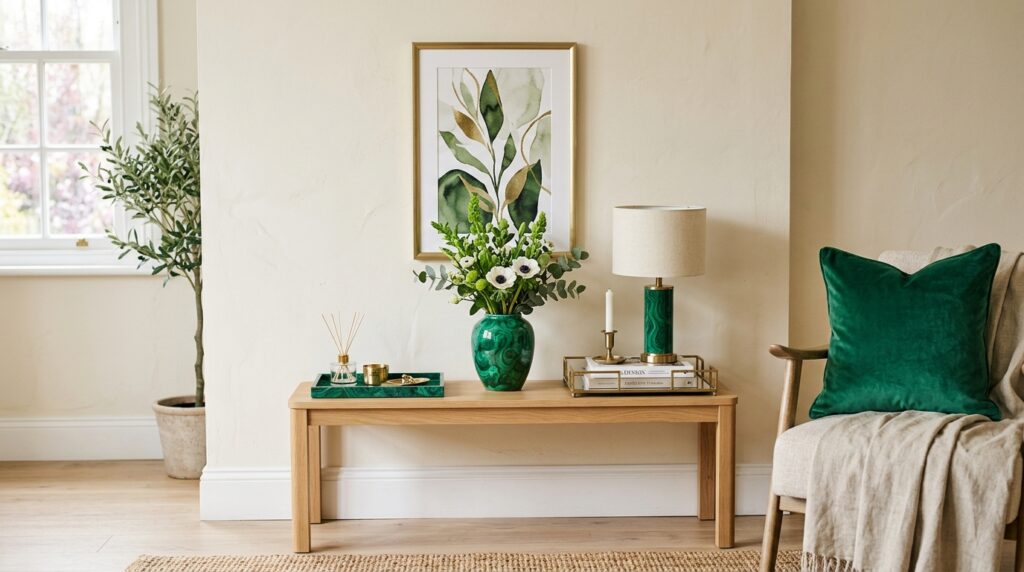
You do not need to paint a room to enjoy this trend. Start with one visible object. A lamp is often the easiest choice because it adds color at eye level and works in bedrooms, living rooms, offices, and entryways. A malachite-patterned tray, vase, or picture frame can also bring the shade into a neutral room.
Textiles are another simple route. Try a velvet pillow, border-trimmed curtain, patterned rug, or throw blanket. These pieces are easy to change seasonally and can help you decide whether the malachite spring trending color feels right in your home. If you like the effect, move to larger choices such as painted furniture, wallpaper, or tile.
Artwork may be the most flexible option. A painting or print with malachite green can connect different colors already in the room. This is useful when your furniture is neutral, but you want the space to feel more curated.
Using Malachite in Small Rooms
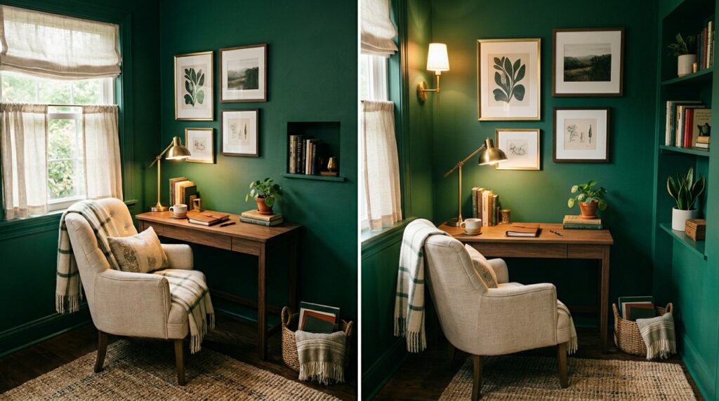
Small rooms do not have to be pale. In fact, a compact space can be the best place to use a bold green because the color feels intentional. A powder room, reading nook, entryway, closet office, or laundry room can handle malachite without overwhelming the rest of the home.
The trick is to keep the design simple. Use fewer materials, repeat finishes, and add good lighting. For example, a small powder room with malachite walls, a stone sink, brass hardware, and a warm mirror can feel complete without much decoration. A tiny office with a malachite bookcase and cream walls can feel focused and stylish.
If the room has low light, avoid muddy versions of green. Choose a cleaner, richer shade and add layered lighting. Wall sconces, table lamps, and reflective accessories can keep the space from feeling closed in.
Common Mistakes to Avoid
The biggest mistake is using malachite without considering undertones. Some versions lean blue, some lean yellow, and some have a deeper emerald cast. If your room has warm floors, cream furniture, and brass, a slightly warmer malachite may feel more connected. If your space has black, marble, chrome, or cool gray, a blue-green version may look cleaner.
Another mistake is using too many green items that almost match but not quite. A malachite wall, olive sofa, mint pillows, and sage curtains can look accidental if the undertones clash. If you love layered greens, separate them with neutrals, wood, or pattern. Let malachite be the richest green, then support it with softer tones.
Also, avoid choosing the color from a small chip only. Large samples matter because strong greens change throughout the day. Look at the sample in morning light, afternoon light, and evening lamp light before making a final decision.
Malachite for Different Design Styles
Malachite is more versatile than it first appears. In a traditional home, it works with brass, carved wood, framed art, patterned rugs, and marble. In a modern home, it can appear on sleek cabinets, sculptural chairs, or a single painted wall. In a vintage-inspired room, it pairs well with cane furniture, pleated lampshades, old books, and warm metals.
For a coastal home, use the malachite spring trending color sparingly with white, sand, pale blue, and natural fiber. For a maximalist room, layer it with red, ochre, deep blue, and patterned textiles. For a minimalist room, keep it to one clean statement, such as a glossy side table or a painted door.
The shade becomes more approachable when it matches the language of the home. A farmhouse space may need a softer painted cabinet. A city apartment may suit a lacquered console. A historic house may carry glossy tile beautifully.
Materials That Make Malachite Look Expensive
Malachite looks best when paired with materials that have texture and weight. Brass is a natural partner because its warmth balances green’s coolness. Walnut and oak add earthiness. Marble and stone reinforce the mineral mood. Linen keeps it relaxed. Velvet makes it feel deep and soft. Black accents sharpen the whole palette.
Avoid surrounding malachite with too many shiny synthetic finishes unless that is the look you want. The color already has intensity, so natural materials help it feel grounded. This is especially important when using malachite in a main living area rather than a small accent space.
Pattern also matters. Stripes, botanical prints, block prints, and small-scale florals can soften malachite. Geometric patterns make it feel cleaner and more modern. If you use a malachite-patterned surface, keep nearby patterns quieter so the room does not feel busy.
Is Malachite a Trend or a Long-Term Color?
Malachite is having a strong spring moment, but it is not a throwaway color. Its source is natural, its history is decorative, and its visual depth gives it more staying power than many short-lived bright colors. The malachite spring trending color may be popular now, but the shade itself belongs to a larger family of jewel greens that have appeared in interiors for generations.
A trend becomes lasting when it supports the room instead of shouting for attention. Malachite can do that when it is used with restraint, good lighting, and materials that make sense for the home.
Conclusion:
The malachite spring trending color is powerful because it offers both freshness and depth. It brings the energy people want in spring, but it also has the richness needed for a grown-up, lasting interior. Whether used on a glossy powder room wall, a kitchen island, a velvet pillow, a lamp, or a painted bookcase, malachite can make a room feel more personal and complete.
The best approach is not to copy a trend exactly. Use malachite in a way that suits your light, furniture, materials, and comfort level. Start small if you are cautious. Go bold if your room can carry it. Either way, this vivid green can add life, polish, and a clear point of view to the home.
Frequently Asked Questions:
What color is malachite?
Malachite is a rich green inspired by the natural mineral of the same name. It often sits between emerald, deep green, and blue-green, with a polished jewel-like quality. In interiors, the malachite spring trending color usually means a saturated green that feels vivid, layered, and elegant rather than pale or muted.
Is malachite green good for small rooms?
Yes, malachite can work beautifully in small rooms when the design is controlled. Powder rooms, reading nooks, entryways, and small offices are good places to try it. Use simple materials, warm lighting, and a limited palette so the room feels intentional instead of crowded.
What colors go best with malachite green?
Malachite pairs well with cream, ivory, warm white, brass, walnut, oak, camel, clay, blush, pale blue, black, and marble. For a fresh spring look, use lighter accents. For a richer year-round look, pair it with deep brown, bronze, burgundy, or natural wood.
Should I use malachite as paint or decor?
Both can work. If you are new to strong color, start with decor such as lamps, pillows, artwork, trays, or curtains. If you already love green, try painting on a door, bookcase, vanity, island, or accent wall. Paint creates more impact, while decor gives more flexibility.
What finish looks best with malachite paint?
Eggshell and satin are practical for most rooms, while high-gloss creates a dramatic jewel-box effect in small spaces. Matte can look elegant in bedrooms and dining rooms, but it may soften the stone-like quality. For cabinets and trim, satin or semi-gloss is usually easier to clean.
Will malachite green go out of style quickly?
The trend may peak seasonally, but malachite itself has lasting appeal because it is tied to nature, minerals, and classic jewel-tone interiors. Use it with quality materials and balanced colors, and it can feel timeless rather than temporary.