Dreamy 22 Living Room Gallery Wall Ideas to Turn a Blank Wall Into a Statement

A bare living room wall is a missed opportunity. It’s the first thing guests notice when they walk in, and an empty stretch of drywall rarely tells them anything about who lives there. That’s why living room gallery wall ideas have become one of the most-searched home-decor topics over the past few years — they solve a real problem without requiring a renovation budget. Whether you have a single sofa-backed wall or a soaring two-story space, the right combination of frames, art, and spacing can turn that blank canvas into the room’s focal point.
This guide moves beyond generic inspiration boards. Below, you’ll find 22 living room gallery wall ideas organized by layout, style, material, and content, plus the measurements, tools, and planning steps most roundups skip entirely. By the end, you’ll know exactly how high to hang your first frame, how far apart to space each piece, and which layout actually fits the furniture you already own, instead of guessing and patching nail holes later.
Most articles on this topic stop at pretty photos without explaining why a layout works or how to recreate it in a real living room. These living room gallery wall ideas are built differently: each one includes the practical details — spacing, sizing, or material choice — that turn a screenshot into a finished wall you can actually build this weekend using tools you likely already have at home. No special skills or contractor visit required, just a measuring tape, patience, and a clear plan.
How to Plan a Living Room Gallery Wall Before You Hang Anything
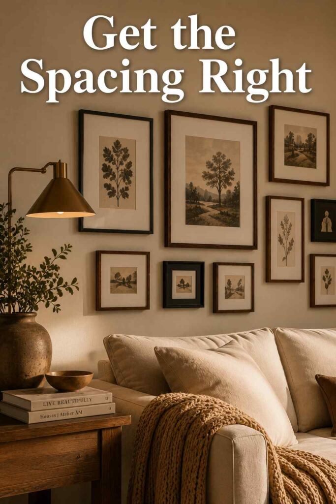
Most gallery walls fail not because of bad art, but because of poor planning. Interior designers commonly use the 57-inch rule, which places the center of your gallery wall 57 inches from the floor — the average adult eye level. If your wall sits above a sofa, measure up 6 to 8 inches from the top of the cushions instead, so the art feels connected to your living room furniture arrangement rather than floating awkwardly above it, disconnected from the seating below.
Spacing matters just as much as height. Leave 2 to 3 inches between each frame for a cohesive, gallery-style look — tighter spacing tends to feel cramped, while wider gaps can make the collection read as scattered rather than curated. For sizing, your overall arrangement should span roughly two-thirds the width of the furniture piece beneath it, whether that’s a sofa, console, or media unit, so the proportions feel balanced instead of oversized or lost against the wall.
Before drilling anything, trace each frame onto kraft paper, cut it out, and tape the paper templates to the wall using painter’s tape. This lets you rearrange freely, photograph the layout, and adjust spacing without a single unnecessary nail hole. A small level, a tape measure, and museum putty for smaller or lightweight pieces round out the essential toolkit. Photograph the finished template layout before removing any paper piece, so you always have a reference to rebuild the exact arrangement later, even after the frames come down for cleaning, repainting, or a seasonal refresh.
Choosing the Right Living Room Gallery Wall Ideas for Your Space
Not every layout suits every room, so it helps to narrow the field before you start measuring. If your living room already leans traditional or formal, structured layouts tend to read as more intentional than free-form ones, especially alongside symmetrical furniture and classic trim work. If the room is casual and lived-in, a looser arrangement usually fits the existing energy better, letting the wall feel collected rather than curated within an inch of its life.
Wall size matters too. Compact apartment living rooms generally do better with one focused cluster rather than a sprawling display that competes with limited furniture and floor space. Larger, open-concept living rooms can support bigger, bolder living room gallery wall ideas that stretch across an entire wall or wrap around a corner, since there’s enough visual breathing room to support the added scale without the room feeling crowded or busy.
Layout-Driven Living Room Gallery Wall Ideas
1. The Classic Grid
A grid layout uses identical frame sizes and equal spacing arranged in even rows and columns. It’s the most structured of all living room gallery wall ideas, making it ideal for modern or minimalist spaces where clean lines matter more than eclectic charm. Stick to one frame color and consistent matting throughout the arrangement for maximum visual impact, and use a laser level to keep every row perfectly aligned before committing to a single nail hole in the drywall.
2. Salon-Style Eclectic Wall
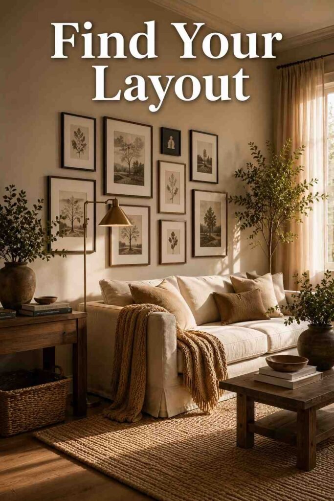
Salon walls mix frame sizes, orientations, and art styles in an intentionally organic layout that feels collected rather than planned. Start with your largest piece slightly off-center, then build outward with progressively smaller frames, filling gaps as they appear rather than mapping every inch in advance. This collected-over-time feel works beautifully in living rooms with existing character, like exposed brick, built-in shelving, or a fireplace mantel that already carries visual weight in the room.
3. Horizontal Row Above the Sofa
A single row of evenly sized frames stretched above a long sofa creates a clean, wide focal point without overwhelming the wall. Keep every frame aligned by center height, and match the row’s total width to roughly two-thirds of the sofa below it for proportion that feels intentional rather than accidental. This layout suits living rooms that already have strong horizontal lines, such as a low media console or a wide picture window on the opposite wall.
4. Vertical Column for Narrow Walls
Narrow spaces beside a window or fireplace benefit from a stacked vertical column of three to five frames, aligned along a single centerline. This draws the eye upward, making low ceilings feel noticeably taller than they actually are. It’s one of the more underused living room gallery wall ideas, yet it solves an awkward layout problem — a tall, skinny wall segment — better than almost any grid or salon-style arrangement could manage.
5. Picture Ledge Gallery Wall
Floating picture ledges let you lean frames instead of drilling a hole for each piece. Layer pieces two or three deep, overlapping edges slightly for depth, and rotate the front layer whenever your mood or the season changes. Because nothing is permanently fixed to the wall, you can refresh the entire display in minutes without patching a single hole, making this one of the most flexible options for renters and frequent redecorators alike.
6. Wraparound Corner Gallery Wall
Instead of stopping the arrangement at the corner, let it bend naturally onto the adjoining wall. Use smaller, lighter frames on the perpendicular section so the transition feels intentional rather than like an afterthought squeezed into leftover space. This idea works especially well in open-concept living rooms where two walls meet near a seating area, turning what would otherwise be a dead corner into an extension of the main display.
Style-Specific Gallery Wall Ideas for Every Living Room
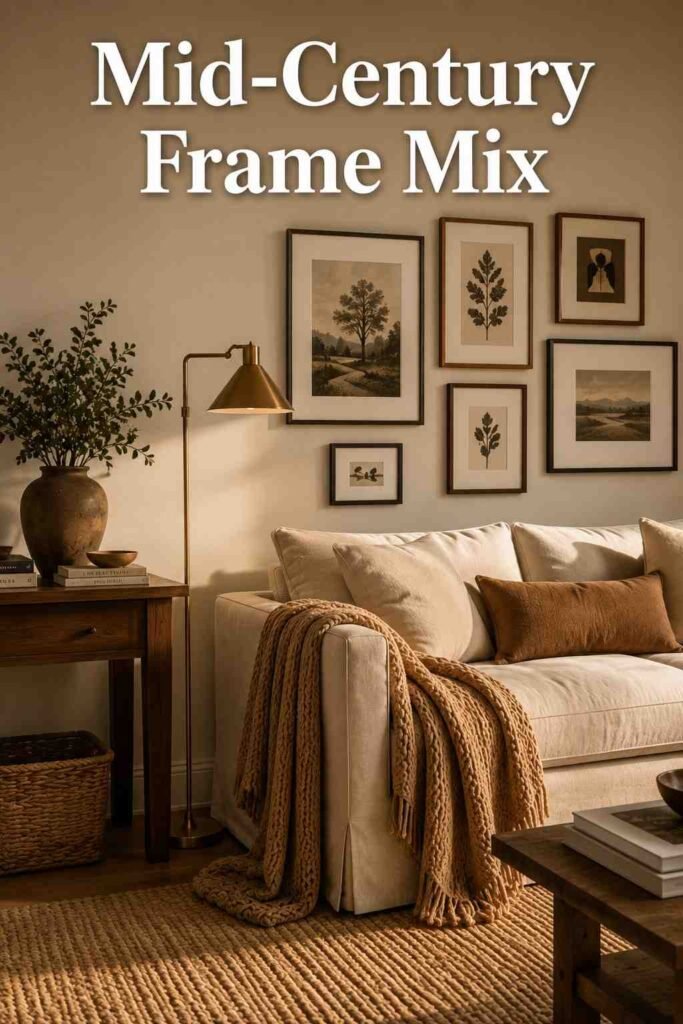
7. Mid-Century Modern Frame Mix
Pair thin wood or brass frames with abstract shapes and warm, earthy prints to echo the era’s signature restraint. Keep the palette limited to two or three tones so the wall complements a mid-century sofa or teak media console without competing against it for attention. Adding one sculptural, asymmetrical piece near the center of the arrangement gives the eye a natural resting point within the otherwise clean, linear composition.
8. Modern Farmhouse Wood Frame Wall
Weathered wood frames in varying stains — walnut, oak, and whitewashed — paired with botanical or vintage-inspired prints create a warm, collected farmhouse feel throughout the living room. Mixing in textures like a woven basket, a small clock, or a rustic mirror adds dimension without cluttering the arrangement or pulling focus from the frames themselves. This approach pairs naturally with shiplap, exposed beams, or other farmhouse-leaning architectural details already present in the room.
9. Minimalist Monochrome Wall
Choose black-and-white or single-color frames with generous matting and simple line-art prints for a restrained, gallery-like feel. This is one of the calmest living room gallery wall ideas, working best in spaces where the walls are already a neutral backdrop, like off-white, soft greige, or pale gray. Leave slightly more breathing room between pieces than usual, since minimalist arrangements rely on negative space as much as the art itself for visual balance.
10. Maximalist Color-Block Wall
For bold personalities, mix saturated frame colors with vibrant prints and patterns across the entire arrangement without a strict formula. The goal is energy and personality, not restraint, so don’t be afraid to combine clashing hues if they genuinely reflect your taste. Balance the intensity by keeping furniture, flooring, and adjacent walls relatively neutral, so the gallery wall reads as an intentional statement piece rather than visual chaos. A single unifying element, like one recurring color across several frames, keeps the boldness from tipping into total disorder.
11. Boho Woven and Textile Wall
Combine framed prints with woven wall hangings, macramé, and rattan-framed mirrors for a layered, textural display full of natural materials. This idea softens a living room with hard flooring or minimal furniture, adding warmth through material variety rather than relying on color alone to carry the room. Vary the depth of each piece slightly, letting some frames sit flush while woven pieces project outward for added dimension, so the wall casts subtle shadows as the light shifts through the day.
12. Coastal Neutral Wall
Pair driftwood or whitewashed frames with linen-textured prints in sandy, blue, and white tones for an airy, relaxed feel. Keep spacing slightly wider than usual — around 3 to 4 inches — to preserve the uncluttered, breezy character coastal interiors are known for throughout the rest of the home. A single oversized botanical or seascape print anchoring one end of the arrangement keeps the display from feeling too busy or scattered.
Texture and Material Gallery Wall Ideas
13. Mirror-Integrated Gallery Wall
Adding one or two mirrors into your arrangement bounces natural light around the room and breaks up an otherwise flat wall of frames. Position mirrors at varying heights within the layout rather than centering them, so they read as part of the collection instead of an afterthought bolted on separately. This idea works particularly well in living rooms with limited natural light, where the added reflection makes the entire space feel brighter and larger.
14. Sculptural and 3D Object Wall
Small wall-mounted shelves, decorative plates, or a single sconce mixed among framed art add real depth that flat frames alone can’t achieve on their own. This works particularly well when paired with an existing accent wall ideas approach, where texture already plays a starring role in the room’s overall design. Keep the 3D elements to no more than a quarter of the total pieces, so the wall still reads as a gallery rather than a shelf display.
15. Woven and Fiber Art Wall
Beyond typical boho textiles, consider handwoven tapestries or fiber wall art as anchor pieces, then surround them with smaller framed prints for contrast. The interplay between soft fiber and hard frame edges creates visual rhythm across the wall that flat art alone rarely achieves. Neutral, undyed fiber pieces tend to pair best with warm wood frames, while dyed or patterned textiles work well alongside black or white frames for added contrast.
16. Metallic Frame Accent Wall
Brass, gold, or brushed nickel frames mixed with black-and-white photography add a polished, slightly formal edge to an otherwise casual room. This idea suits living rooms with existing metallic hardware, like lighting fixtures, drawer pulls, or coffee table legs, tying the whole space together visually. Keep the metallic finishes consistent across every frame in the arrangement, since mixing gold and nickel within the same wall can make the display feel unintentional.
Content-Themed Living Room Gallery Wall Ideas
17. Black-and-White Photography Wall
A monochrome photo collection never goes out of style and works with nearly any furniture palette or architectural period. Vary the tones within your black-and-white selection — true black, warm sepia, and soft gray — to avoid a flat, repetitive look across the entire wall. Mixing candid shots with a few formally composed portraits adds visual interest without breaking the overall monochrome theme holding the arrangement together, and a mix of frame widths keeps the wall from feeling too uniform.
18. Family Photo Timeline Wall
Arrange photos chronologically, from oldest to most recent, in a horizontal or gently diagonal line across the wall. This idea turns a gallery wall into a genuine keepsake, and it’s one of the most requested living room gallery wall ideas among families with young children who want to track growth over the years. Leave a small amount of extra space at one end of the timeline so new photos can be added without disrupting the existing layout.
19. Travel-Inspired Map and Print Wall
Combine vintage maps, ticket stubs, and travel photography in mismatched frames for a well-traveled, personal feel. Group pieces by continent or trip for a sense of order within the eclecticism, rather than scattering destinations randomly across the wall. Leaving a small gap or two within the layout gives you room to add new destinations as your collection grows, without needing to rehang the entire arrangement each time you return from a trip.
20. Botanical and Nature Print Wall
Pressed leaves, botanical illustrations, and landscape photography bring an organic, calming quality to an otherwise busy living space. Pair the artwork with light wood or white frames to keep the focus on the greenery and natural tones rather than the hardware surrounding it. This idea pairs especially well with real houseplants nearby, letting the framed botanicals echo the living greenery already present in the room for a cohesive, nature-inspired feel.
Practical and Renter-Friendly Gallery Wall Ideas
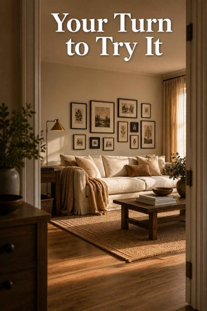
21. No-Drill Command Strips Wall
Heavy-duty adhesive strips now hold frames weighing several pounds without requiring a single nail or screw. This is the most practical of all living room gallery wall ideas for renters, letting you remove or completely rearrange the display without leaving a mark on the wall behind you. Always check the weight rating printed on the packaging before hanging heavier frames, and use two strips per side for anything larger than a standard 8-by-10 frame.
22. Budget Thrift-Store Frame Wall
Collect mismatched secondhand frames from thrift stores or yard sales, then unify them with a single coat of spray paint in one consistent color. Fill them with free printable art, postcards, pressed flowers, or fabric scraps instead of buying expensive prints for every opening. This approach proves a striking wall doesn’t require a large budget, just a consistent color story and frame finish tying every individual piece together into one cohesive display.
Common Mistakes to Avoid
Hanging art too high is the single most common error, often leaving several inches of dead space above the frames and below the ceiling line. Uneven spacing is a close second — inconsistent gaps between frames make even expensive, well-chosen art look careless and unplanned. Skipping the paper-template step is another frequent misstep, since it’s much harder to judge spacing and balance once several nail holes already exist in the drywall.
Finally, resist the urge to match every single frame perfectly. A well-planned living room furniture arrangement paired with slightly varied frame styles almost always looks more curated than a rigid, matchy display. If sourcing a ready-made set feels overwhelming, curated collections from outinteriors are pre-sized for standard sofa widths, which removes much of the guesswork around scale and spacing described throughout this guide, letting you skip straight to hanging.
Conclusion
A gallery wall is one of the few living room upgrades that costs little, requires no construction, and can be completely reimagined whenever your taste changes. From structured grids to free-flowing salon walls, these 22 living room gallery wall ideas give you a real starting point, backed by the same measurements and planning steps designers rely on every day. Start with paper templates, commit to consistent spacing, and let the wall grow one frame at a time rather than rushing to fill every inch at once.
Whichever direction you choose, the best living room gallery wall ideas share one thing in common: they reflect the people who actually live in the room, not just a trend borrowed from someone else’s home. Treat the wall as a living project rather than a finished product, and expect it to evolve as your collection, your taste, and your living room itself continue to change over time. That flexibility is what makes a gallery wall worth the effort in the first place.
Frequently Asked Questions
1. How many frames do I need for a living room gallery wall?
Most living room gallery wall ideas work well with 9 to 15 frames, though smaller walls can look complete with as few as 5 to 7 pieces arranged thoughtfully around a single anchor.
2. What height should a gallery wall be hung at?
Center the arrangement around 57 inches from the floor, or 6 to 8 inches above furniture like a sofa or console table, so it feels connected to the room below it.
3. How much space should be between frames?
Leave 2 to 3 inches between frames for a cohesive look, or slightly more for airy, coastal-style arrangements that rely on negative space.
4. Can I create a gallery wall without drilling holes?
Yes. Heavy-duty adhesive strips and picture ledges both allow you to build a full display without permanent damage, making them ideal for rental living rooms and frequent movers.
5. Do all the frames need to match?
No. Salon-style and eclectic layouts intentionally mix frame colors, sizes, and finishes for a collected, personal look, while grid layouts rely on matching frames for a cleaner, more formal effect.
6. What’s the best layout for a small living room?
A vertical column or a tight grid tends to work best in compact spaces, since it draws the eye upward without overwhelming a narrow wall or crowding nearby furniture.
7. How do I plan the layout before hanging anything?
Trace each frame onto kraft paper, cut it out, and tape the templates to the wall to test spacing and arrangement before a single nail goes into the drywall.